


This website uses cookies to help improve your user experience


Type “Smart TV design best practices” into search, and you instantly see the usual mantra about big tiles, bigger fonts, three-click journeys, clean screens, and “use the remote wisely”. And while none of that is wrong, it is so generic that you could paste the same checklist under a dozen blog logos and nobody would raise an eyebrow.
The uncomfortable truth is that these rules only cover the first ten percent of reality. Anyone who has shipped a Smart TV app to millions of users knows that the real story begins after the textbook advice has been ticked off. It starts when a five-year-old TV in a small town drops out of memory in the middle of a live match. It starts when an EPG that looked flawless in Figma quietly destroys tune-in rates. It starts when a store reviewer rejects your app because the Back button behaves “almost” correctly instead of exactly as the platform expects.
At that moment, theory stops helping, and the only thing that counts is experience, the kind you gain by living through these edge cases, fixing them under pressure, and then designing so they never happen again.
Before we move to how Smart TV interfaces actually work, it’s worth mentioning that teams exploring Smart TV app development services usually benefit from understanding these fundamentals early. It sets more realistic expectations for design, performance, and delivery.
Alexey Zaberezhny, one of Oxagile’s key voices in this domain, sums it up neatly when he says that Smart TV design only looks simple when you have never tried to ship it, and this article is written very much from that perspective.
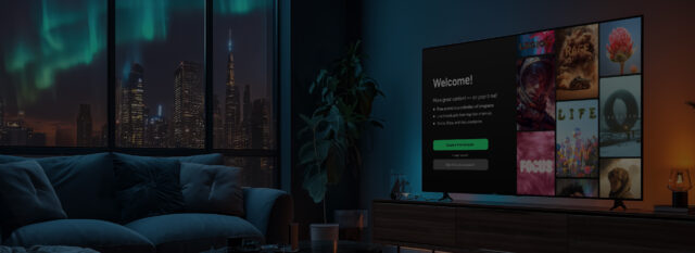
Smart TV UX only starts making sense when you think about how people actually use TV apps: from several meters away, with a remote, often tired, and usually wanting to reach something familiar without much effort. This simple context influences almost every design decision and explains why interfaces built for TVs need a different approach than those built for web or mobile.
Once the living room basics are clear, the next step is shaping the interface so users can move through it quickly and comfortably. We rely on a set of practical rules formed across Smart TV projects — rules based on real behavior rather than generic “best practices”. These principles help align the screen, the navigation, and the content in a way that feels natural to the viewer.
Here is how these ideas come together in real Smart TV design.
“The simpler, the better” sounds generic until you see how much it changes behavior in living-room use. A Smart TV screen doesn’t receive the same level of attention as a laptop or phone. TV viewing is a lean-back experience, where people glance and expect comfort, while mobile and desktop apps rely on lean-forward engagement and active focus. If the layout is crowded or the structure is unclear, they hesitate before acting.
This is why it’s important to focus on:
The goal is not aesthetic minimalism, but rather instant understanding. If a user needs even a moment to “figure out” where to go next, the UX is already too heavy.
One of the strongest real-life principles in Smart TV UX is the “3 clicks to content” rule. It’s not because it’s catchy, but because it consistently reduces frustration. On a remote device, every step takes more time. A few extra presses might feel minor on paper, but they become a source of friction if they are repeated across daily use.
To avoid that, structure flows so the viewer can reach key areas fast:
This creates a sense of speed, even when the Smart TV UI design itself is simple.
Some actions are simply inefficient on a remote, such as typing, logging in, or searching. However, this doesn’t mean that users have to suffer through it. Two additions make navigation much easier:
When users know what they want, including the voice option in the design for Smart TV is the fastest path to it. It removes typing entirely and helps the user skip menus altogether.
Phones and tablets can handle the following:
This synergy shortcuts many flows and keeps the TV interface focused on what TVs are good at — quick navigation and content consumption.
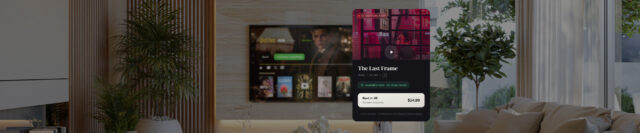
One of the best ways to make the Smart TV user experience feel fast is to help viewers skip the search process altogether. Smart suggestions are important at this point. Well-placed recommendations can shorten entire navigation flows:
This reduces browsing time and lowers cognitive load. When a tired user sees the right option immediately, they feel that the app “understands” them, even though nothing has changed visually in the interface.
Most of the time, Smart TV browsing is about scanning. Users don’t read description blocks unless they’re close to making a decision, but metadata helps them judge their options instantly, even from several meters away. Useful metadata includes:
When these details are clear and visible, the viewer identifies what they’re looking at without extra steps, which again shortens the entire flow.
The above principles of simplicity, short paths, helpful tools, suggestions, and metadata all provide support for one overarching idea: viewers should not have to think. They should simply be able to choose and watch.
A Smart TV interface that respects this expectation is much more effective. This creates a sense of comfort and control for users without requiring extra effort.

Web UX rarely transfers cleanly to TV. Layouts get dense, navigation slows down, and actions require more steps. With the right UX tweaks early on, the porting process becomes smooth and predictable. Oxagile knows how to guide that transition.
If the first part of Smart TV design becomes clear from the couch, the second part becomes clear from the mistakes. Nothing exposes the strengths and weaknesses of a TV app faster than its EPG (Electronic Program Guide). And even though the EPG appears simple at first glance, in practice, it is the part of the interface where small decisions can have considerable consequences.
Most teams learn this the hard way, as an EPG can look perfect during design reviews and still perform poorly in real use. Oxagile has observed this pattern many times, and the lessons from those situations often say more than any best-practice list.

One of the most common issues we encounter is an EPG that impresses on a designer’s screen but causes confusion in daily use. Perfectly aligned columns and neat typography mean very little when a viewer can’t immediately tell what’s live, what just ended, or what is starting soon.
When it comes to real living rooms, people don’t study the guide — instead, they skim through it. If the structure doesn’t enable quick scanning, they simply give up and switch channels manually.
Another common situation comes from trying to keep the screen “clean”. Designers remove elements to simplify the layout, but viewers then need to press the remote several more times just to see basic details, such as show duration, genre, or whether catch-up is available. That may not sound serious in a meeting, but in real use, those extra steps add up and break the flow. In TV UX, every extra click counts.
It’s easy to forget how wide the real hardware landscape is. An EPG that scrolls smoothly on a new Samsung model can stutter or freeze on a five-year-old device with limited memory. Oxagile has seen cases where simple grid animations caused old TVs to lag just enough to ruin the experience.
Designing a Smart TV app involves balancing UX with performance. A smart-looking guide is meaningless if the device cannot handle it.
To clarify, here’s a brief overview of how EPG problems typically appear. These are situations Oxagile has helped clients fix many times:
| What designers expect | What actually happens in real use |
| “Clean layout = easy navigation” | Users can’t identify what’s now, next, or just ended |
| “Minimal information = modern UI” | Viewers miss important details and navigate more |
| “Smooth animations everywhere” | Older TVs slow down, freeze, or delay focus |
| “Looks great on a designer’s monitor” | Looks busy or unreadable from the sofa |
Rather than presenting another long rulebook, here’s the core truth we’ve learned from our experience: a well-designed EPG enables users to make quick decisions without needing to think. To support that, it needs to show clearly:
The level of engagement increases when this information is clearly visible, even from a distance of several meters. However, when it is hidden or unclear, the level of engagement drops.
The key to getting this right is to view the EPG not just as a design feature, but as a practical tool. Once you understand how easily the EPG can fail (and how clearly users feel that failure), you start to see why so much of Smart TV interface design depends on real-world experience.
Once you understand how users act in the living room, the next challenge comes from the platforms themselves. Smart TV design would be much simpler if every TV behaved the same way, but the reality is quite different. Each platform has its own rules, limitations, and habits, and those differences directly affect design decisions.
This is something teams often discover only after the first prototypes are installed on real devices. Oxagile has worked with Tizen, webOS, Android TV, Titan OS, Roku, and various set-top boxes for years, and one pattern always repeats: you cannot assume one design will function the same way everywhere. Even small differences in hardware and system logic influence the user experience.
To make this clearer, here is a breakdown of how the main platforms usually operate from a design point of view:
Runs fast on newer models, but expects the navigation and UI structure to follow its rules. If something performs differently from what Tizen expects, certification becomes difficult.
Very organized. LG webOS prefers clean layouts, predictable structure, and smooth transitions. Complex screens or unusual focus patterns usually create issues.
Flexible and powerful, but inconsistent across devices. High-end TVs perform well, while operator set-top boxes often require extra optimization for speed and memory.
Minimalistic and strict. Branding freedom is limited on Roku, and the platform wants navigation to be simple and clear. Anything complicated stands out immediately.
Growing quickly. Titan OS supports modern patterns but still changes fast, so the design must remain adaptable to updates and new requirements.
These vary the most. Some set-top boxes are fast, others are slow, and have limited memory. Here design needs the most performance awareness.
While different platforms won’t necessarily break your design, they will shape it. Here are the three points Oxagile returns to in almost every project:
A screen that feels fast on one TV may lag on another.
While the flow may appear identical, the focus logic often requires minor adjustments.
Heavy images, complex carousels, or dense grids might need to be simplified for older hardware.
Here is how the same design decision can produce different results depending on the platform:
| Design element | Works well on | Causes issues on | Why |
| Large full-width artwork | New Samsung, LG | Older set-top boxes | High memory use |
| Heavy animations | Google TV | Roku, low-end TVs | Slower CPUs |
| Wide horizontal carousels | Android TV | Roku | Navigation differences |
| Many content rails on one screen | High-end TVs | Older models | Noticeable focus delay |
This is the kind of detail you only fully understand after seeing dozens of TV models in action, which is why experience with real devices plays a significant role in Smart TV app design. Once the differences between the platforms become clear, the next natural question is: which small UX decisions matter more than people expect?
Branding on Smart TVs works best when it supports the interface instead of reshaping it. Companies want their app to reflect their identity, but the experience still needs to stay readable and predictable across different screens and devices. This becomes especially important because small visual changes that look harmless on a desktop can noticeably affect clarity or navigation on a TV.
The safest way to handle branding is to separate it from the core UX. The navigation, spacing, focus logic, and layout stability should remain consistent, while the colors, logos, and subtle visual accents should be adjusted to reflect the brand. This approach keeps the app familiar for users while giving each company enough room to express its style.
Oxagile worked on a modular OTT solution that needed to serve several telecom operators, each with its own brand identity. Instead of building separate apps, the team designed a flexible core that handled all navigation, performance, and layout rules. Branding was applied as a layer on top, controlled by configuration rather than redesign.
This allowed operators to change colors, logos, and key visuals quickly without touching the underlying experience. Because the UX foundation stayed the same, the branded versions remained smooth and consistent even on older or lower-powered devices.
This made it quicker to get new clients using the app, and it made sure that every version of the app felt stable, clear, and easy to use.
Branding on Smart TVs becomes much safer when a few simple principles guide it:
When branding respects these limits, the app feels stable and recognizable at the same time, and users get a clean experience regardless of the platform or device.
Smart TV design becomes much easier to understand once you stop treating it as “a big screen” and start seeing how many small decisions shape the experience. The distance, the remote, the living room environment, the platform differences, the EPG logic, the branding limits — all of these details influence what viewers feel when they sit down to watch something.
The best Smart TV apps are the ones that respect this from the start. They avoid heavy layouts, confusing navigation, and branding choices that look good in isolation but which complicate everyday use. They perform well on different devices, are intuitive from the outset, and adapt seamlessly when a business needs to introduce a new feature or update the look and feel across multiple platforms.
If you’re deciding whether to adapt an existing product for Smart TVs or build something custom, the right approach depends on the scope, the audience, and the complexity of your ecosystem. Some products can be ported with small adjustments. Others need a dedicated TV interface to deliver a comfortable experience.
Designing a Smart TV app becomes much easier when you work with a team that understands the platforms, the UX specifics, and the performance limits from experience, not theory. If you want guidance, need a second opinion, or are ready to move forward, we’re here to help.
Smart TV interface design has to work from a distance, with limited attention and remote-only navigation. Users lean back, not forward, so the interface needs larger elements, predictable focus movement, and fewer steps. These conditions make designing for Smart TV its own discipline rather than a scaled-up version of other platforms.
Start Smart TV UI design with clarity and navigation. Make sure focus flow is logical, spacing is comfortable, and text is readable from several meters away. Performance matters as well, because heavy screens or complex layouts can slow down older TVs.
The Electronic Program Guide is one of the most frequently used screens, and it directly influences tune-in behavior. If the EPG is confusing, slow, or unclear, users switch channels manually or leave the app. A clear structure and good readability are essential parts of Smart TV interface design.
Design for Smart TV means creating an interface that works comfortably from several meters away, responds well to remote control navigation, and remains clear on different screen sizes and devices. It requires larger elements, predictable focus movement, balanced spacing, and layouts that support quick decisions. Unlike mobile or web, Smart TV design also needs to consider the performance limits of older models and variations across platforms.

