


This website uses cookies to help improve your user experience


Every Formula 1 team on the 2026 grid gets the same two hours on Sunday, the same track, the same weather, and roughly the same lap-time ceiling once the engineers have done their work. The difference shows up in the thousand small decisions each pit wall makes between laps. More than three hundred sensors feed data into the pit wall in real time, and the engineers reading it have seconds to call a strategy change before the window closes. McLaren defended their constructors’ title last season on the back of a telemetry loop tight enough to act on what the car was telling them before the next corner.
OTT is the same sport. Every streaming service has access to the same CDNs, the same device SDKs, the same recommendation libraries on paper, and the same catalog licensing windows. The platforms pulling ahead are the ones whose telemetry loop is tight enough to act on what the subscriber is telling them inside the session, not three weeks later in a retention report. The rest are running a fast car with no radio to the pit wall, and OTT data analytics is what builds that radio.
Building that radio is roughly what the rest of this covers. If you are earlier in the build and the car itself is what you are working on, our live streaming app development guide is a better starting point.
Key takeaways:
Without the vendor framing, an OTT analytics system does one thing: it answers the question that a pit wall engineer deals with every hour of the broadcast: What is about to cost us the race, and is there still time to do something about it?
This question arises in a streaming business when a subscriber’s session degrades for the third week in a row, when a licensed title burns cash without improving retention, or when the bitrate looks fine in aggregate but is poor on the two mobile ISPs where half the user base sits. By the time the monthly review rolls around, none of this is new information. The whole game is whether the signal reaches a decision maker while it still matters.
Cancellation forms collect reasons that are almost always wrong. The user who checks “too expensive” probably churned because the last three titles they tried buffered on Wi-Fi, or because the recommendation rail served the same four thrillers for six weeks.
Playback telemetry and drop-off data tell the actual story: where sessions ended, which title triggered the exit, and whether QoE collapsed before the cancellation event.
With that signal in hand, retention stops being a marketing problem and becomes a product one. Generic discount blasts get replaced by targeted win-back offers aimed at the specific cohort showing the specific QoE or engagement decay. The curve starts responding because the intervention finally matches the cause.
Content is the largest expense on most OTT P&Ls, and without an analytics layer, it is allocated based on instinct. Acquisition teams pursue popular genres, and originals are greenlit based more on a creator’s reputation than on projected retention impact. Licensing deals are renewed simply because they always have been.
A catalog performance model translates that into numbers: cost per retained subscriber by title, watch-through curves by genre, and competition between similar shows. It also considers the actual drag on storage and rights fees from the long tail. The same model usually finds between eight and fifteen percent of content spend that can be reallocated toward titles with stronger retention signal, which often funds the next wave of originals without requiring a budget increase.
Recommendation engines that run on catalog metadata alone end up recommending what everyone else is already watching. The platforms that lift watch time substantially run models on behavior: co-viewing patterns, session chaining, skip behavior, completion curves, time-of-day and device context.
When the rail on the home screen gets that right, a single re-ranking experiment can add minutes per session across the base, which compounds into higher LTV and more ad inventory sold at higher CPM.
Each of those is a revenue play that happens to run on analytics. The event taxonomy, the warehouse schema, the choice of vendor — none of it matters until it feeds a decision somebody in the business actually makes. Which brings us to the metrics.
Any serious OTT analytics dashboard has about twenty metrics, five of which do most of the work. The rest are either engineering-related instrumentation or aggregates of the five primary metrics.
The table below maps the most important metrics to the specific decisions they inform and the revenue line they touch. For operating teams, this is the view worth pinning above the weekly review.
| Metric | What it tells you | Decision it enables | Revenue line |
| Watch time per user | Platform stickiness | Personalization tuning, home screen layout | Retention, ad inventory |
| Buffering ratio | Delivery health | CDN routing, ABR configuration, encoding ladder | Churn reduction |
| Startup time | First-session quality | Player optimization, manifest caching | Trial conversion |
| Completion rate | Content and recommendation fit | Rail re-ranking, catalog pruning | Watch time, content ROI |
| Predictive churn score | At-risk users this week | Targeted offers, personalized surfacing | Retention, LTV |
| ARPU by segment | Pricing headroom | Plan design, geo pricing | Revenue per user |
| Ad fill and yield | Monetization efficiency | Waterfall tuning, audience packaging | Ad revenue |
| Cohort retention curve | True growth quality | Acquisition channel mix, onboarding changes | LTV, CAC payback |
The diagram below shows the full stack. Seven layers, each with a different job, all pointing toward the same output: a business decision that could not have been made without the data flowing through the layers beneath it.
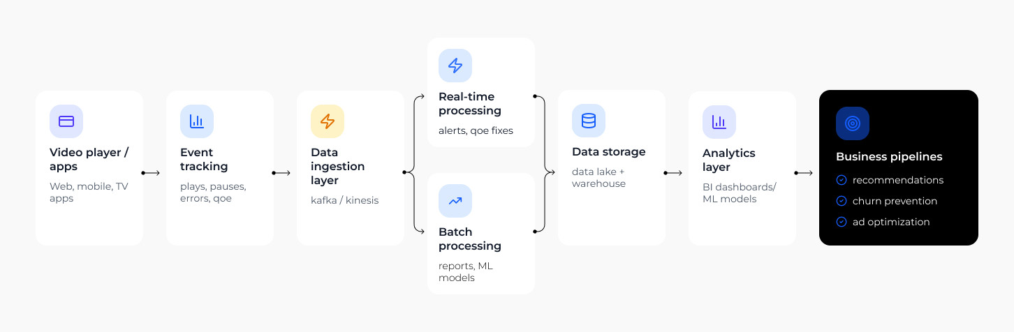
Everything starts with what the player reports: plays, pauses, buffering events, QoE signals, errors. Client SDKs on every device capture these events and route them through the ingestion layer, typically Kafka or Kinesis, where they become a consistent, timestamped stream the rest of the stack can act on. Reliability here is not optional. Drift or loss at this layer means every model downstream is working from incomplete data, and that shows up in the business months before it shows up in an audit.
The live stream splits into two paths. Real-time processing handles anything that needs a response in seconds: QoE alerts, rebuffer thresholds, live ad opportunity bids. ISP degradation incidents get caught at this layer before the support queue opens, and ad inventory gets priced against what is actually happening on the platform right now, not against yesterday’s averages.
The second path handles everything that can wait hours or overnight: cohort curves, catalog performance, marketing attribution, pricing model validation. Batch is where the slower, more strategic questions get answered, and where the finance and content teams end up working from the same numbers for the first time.
Both paths feed into the data layer, typically a combination of a data lake for raw event storage and a warehouse for structured analytical queries. The warehouse is the source of record for any number that ends up in a board deck, and the modeling layer on top of it is what everything above depends on.
On top of the warehouse sit the BI dashboards and the machine learning models. Dashboards answer the operational questions the business asks every week. The ML models, recommendation engines, churn prediction, content valuation answer questions the business did not know it could ask, and feed their outputs back into the product surface as features. This layer takes the longest to pay back and is usually the first to get underfunded, which is also why the teams that invest in it steadily pull away from the field over multiple seasons.
The output of the stack is not a report. It is a decision: which content to surface, which subscriber to reach before they cancel, which ad inventory to reprice. This is the layer where recommendations, churn prevention, and ad optimization either pay back the analytics investment or confirm it was never properly connected to the product in the first place.
Oxagile designs this architecture end to end, builds the data pipelines, and integrates the BI and ML layers as a single engagement. For platforms that need the analytics layer specifically, our custom OTT analytics work covers that scope. For the BI and visualization layer, our business intelligence practice is the relevant starting point.

Most platforms we talk to already collect the data they need. The problem is usually somewhere between the signal and the decision: a pipeline that runs too slow, a model that never got built, a dashboard nobody acts on. Oxagile works with OTT operators to close that gap, whether that means building the stack from scratch or fixing the layer that is holding everything else back.
A predictive churn model running against recent behavior data flags at-risk users with enough lead time for a retention offer to reach them before they cancel. The specific intervention depends on what the signal looked like:
Oxagile builds these layers into interactivity and personalization services already running on client platforms, so the retention logic sits inside the existing product surface.
Recommendation engines trained on behavior data lift home-screen watch time by roughly 10-20% in our deployments, depending on the platform’s starting point. Almost all of that lift comes from mid-tail titles that a metadata-only model would have left buried, which is the part of the catalog where licensing economics are thinnest and every incremental view matters most.
A catalog performance model provides the content team with actual numbers on cost per retained subscriber at the title level and saturation at the genre level. It also shows which specific international titles are performing disproportionately well in certain regions. With these numbers in hand, the finance and content teams can have a quarterly budget conversation, and the reallocated spending is usually enough to cover the next commissioning slate without a top-line increase.
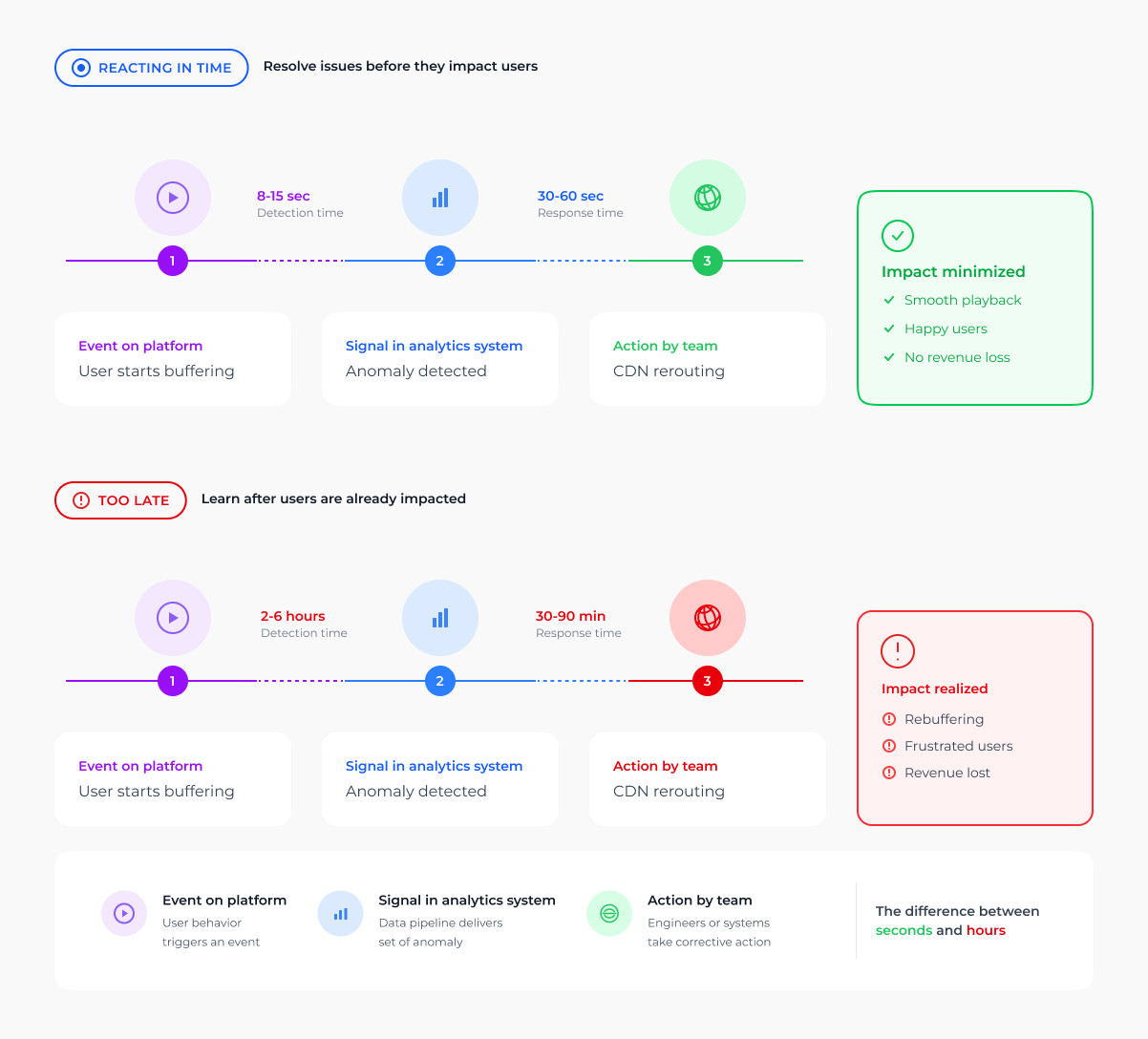
QoE incidents can be identified in minutes using live telemetry on startup time, rebuffer ratio, and bitrate stability, which is segmented down to CDN, ISP, device, and geography. When 4K playback on one ISP in one region begins to degrade, the operations team has time to act before the support queue opens. They can reroute traffic, swap encoder profiles, or adjust the manifest. A pit wall that reads an undercut a lap late spends the rest of the stint behind the problem. The same window exists here, and it closes at roughly the same speed.
First-party segments built from actual viewing behavior sell at materially better CPMs than the open-exchange inventory most platforms fall back on by default. Combined with yield optimization across the waterfall, the effect is ad revenue that grows faster than session volume, which is the operating pattern a sustainable AVOD or hybrid model runs on.

A live sports broadcaster came to Oxagile with a deceptively hard problem. They wanted to surface the key moments of a match while the match was still being played, in seconds, fast enough to push them as social clips and in-app highlights before fans had scrolled past. The post-game edit arrives hours late by definition, and the volume of matches the broadcaster covers ruled out an editorial team that scaled with the workload.
The pipeline Oxagile built reads the live feed, scores event importance against a sport-specific model, and produces packaged highlights within seconds of the play. Editorial work shifted from assembly to curation, which is a different job at a different headcount.
The highlight stream then became its own surface inside the app, with its own ad inventory category the platform could sell into for the first time. Viewers got a way to follow a match they had missed without sitting through a ninety-minute replay, and the engagement curves followed accordingly.
OTT platforms have always handled sensitive behavioral data, but the environment around that data has changed significantly. The deprecation of third-party cookies across major browsers has added a layer of complexity that most platforms are still working through. First-party identity now has to carry segmentation work it was never designed to do alone, and regulatory requirements have expanded into markets where streaming is growing fastest.
A few things worth keeping in mind when designing or auditing an OTT analytics stack for data compliance:
GDPR in Europe, CCPA and CPRA in the US, and expanding frameworks across APAC and Latin America share the same underlying logic: collect against known identifiers, hold only what you need, and give users real visibility into how their data is used. Designing for the strictest framework in your market tends to cover most of the others.
Consent signals collected at the SDK level need to propagate through the entire event pipeline. A user who declines targeting should not resurface inside a churn model or an ad segment downstream. Most consent failures are pipeline failures, not policy ones.
Analytics workloads should run against pseudonymous identifiers instead of raw personal data. This limits exposure in breach scenarios and keeps regulatory audits from becoming architecture reviews.
A race is won across the six days before Sunday, and protected during the two hours that count by acting on what the car is telling the pit wall fast enough to matter. Sunday is just when it becomes visible.
The platforms pulling ahead in streaming are running the same logic, not doing something exotic. They are just reading their own data on a shorter loop than their competitors and making decisions that are slightly less wrong, slightly faster, every week until the retention curve starts moving in a direction the content budget alone was never going to produce.
Most OTT platforms have the data. The gap is in how fast it reaches a decision. Oxagile builds the analytics systems that close that gap, across live streaming, VOD, sports, and hybrid monetization models.

OTT analytics is the collection, processing, and modeling of data from over-the-top video platforms, with the goal of driving retention, watch time, content ROI, and monetization yield. It covers engagement data, QoE telemetry, monetization metrics, and predictive models, and it works when the output of the system is a decision the business acts on, not a report it files.
OTT data informs five operating decisions: which users to retain and how, which content to acquire or renew, which recommendations to surface, which ad inventory to price at which yield, and which QoE issues to fix before they cost subscribers. Everything else is downstream of those five.
Watch time, buffering ratio, startup time, content completion rate, churn rate and predictive churn signals, ARPU and LTV, and cohort retention curves. Segmented correctly by plan, device, geography, and acquisition source, those cover almost every business question a streaming operator needs to answer.

