


This website uses cookies to help improve your user experience


Apple TV navigation isn’t usually a problem at the beginning of a project. Instead, it behaves more like a polite stagehand who quietly moves scenery in the dark while everyone’s attention remains fixed on the actors, script, and lights.
Everything works as it should: screens appear, buttons respond, and the remote moves focus from one element to the next. Nothing seems broken, so nothing demands discussion. For a time, it feels as if the platform has solved the problem for you, wrapping navigation so tightly into the fabric of the system that it disappears from view.
This illusion lasts only as long as the interface remains uncomplicated. Once screens carry real intent and some actions matter more than others, once content grows denser and flows overlap, navigation stops behaving like background machinery. Instead, it behaves like a conversation partner with its own logic and limitations.
Focus moves where the geometry dictates, despite where the product logic would prefer it. Suddenly, two apps that appear similar in screenshots begin to feel entirely different once a remote comes into play.
Somewhere along the way, tvOS Focus Engine steps into focus itself. Navigation has been flowing according to the shape of the screen all along, and the interface has finally reached a point where shape alone no longer carries enough meaning. Focus Engine provides that missing layer of guidance, helping navigation stay aligned as complexity grows.
Understanding the difference between where the system ends and where guidance begins is what separates Apple TV apps that simply function from those that feel carefully designed, especially as they become more complex over time.

This Focus Engine tvOS guide is informed by Alexey Rossennik, iOS Tech Lead at Oxagile, and his hands-on experience building Apple TV apps where navigation carries real weight. He looks at tvOS Focus Engine as part of Apple’s broader UI language, something that quietly supports simple layouts and asks for attention once the interface itself starts demanding more precision.
According to Apple’s documentation, tvOS Focus Engine is the system responsible for managing focus-based navigation on Apple TV, allowing users to move through interface elements using a remote control instead of direct touch input. It works by evaluating the view hierarchy, visibility, and spatial relationships between UI elements, then determining which element should receive focus at any given moment.
Importantly, Focus Engine is built into tvOS and works automatically with standard UI components, without requiring explicit configuration in most cases. Developers interact with it only when they need to influence focus movement, entry points, or focus persistence in more complex or non-linear interfaces, using the APIs Apple exposes for that purpose.
Apple positions Focus Engine as a core part of the tvOS UI system, designed to support predictable, remote-driven interaction on large screens viewed from a distance.
Focus navigation on Apple TV feels almost disarmingly cooperative at first contact. As you move the remote, the interface reacts without hesitation, and the focus moves across elements with a calm sense of order that rarely invites questions. Everything responds the way you would expect, so smoothly that navigation fades into the background and simply becomes part of how the screen behaves.
Apple TV Focus Engine automatically evaluates the layout geometry, view hierarchy, and visibility, and then builds a navigation map based on its findings. As long as the interface adheres to a clear grid-like logic, the movement of the focus tends to align with user expectations, eliminating the need for explicit input from developers.
As our tech lead, Alexey Rossennik, puts it:
“If you build a screen with standard components and a clean structure, the system already knows what to do. Focus moves across elements exactly how you would expect, and in most cases, nobody needs to interfere.”
Many Apple TV apps initially seem “fine”. The engine is quietly doing its job of interpreting structure as intent.
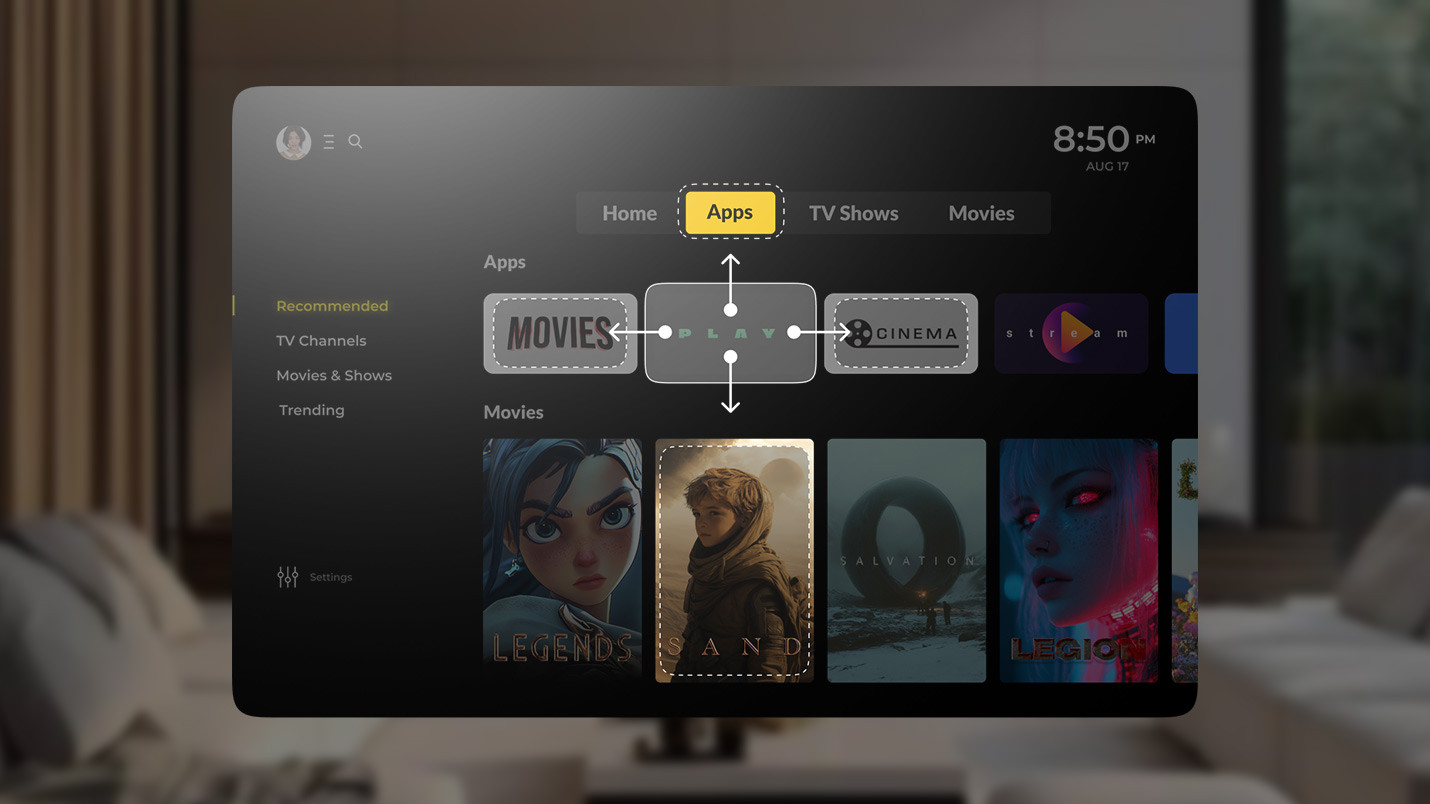
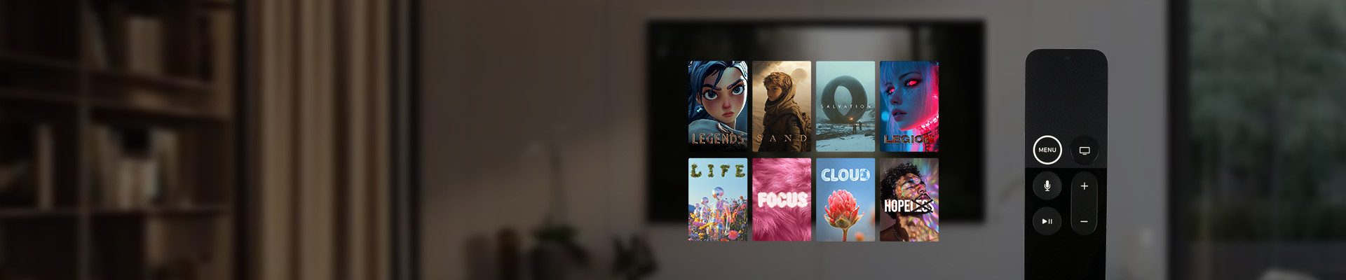
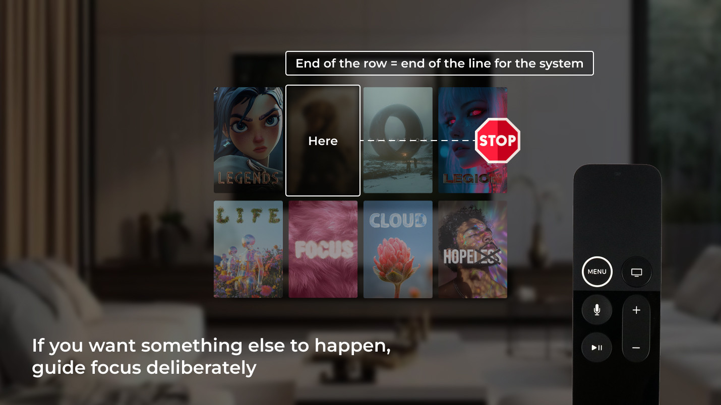
Imagine that this screen represents a typical content selection layout. In this example, the cards are aligned in rows, the spacing is consistent, and each element sits exactly where it should be.
When a user navigates right on the remote, focus moves to the next card. Another press or swipe moves it further along the row. Once the last card is reached, focus stops. Going right again does nothing because there is nowhere else to go in that direction. This behavior is perfectly logical from the system’s point of view.
Alexey explains it this way:
“Focus Engine looks at what is next in that direction. If there is no eligible element, it simply stops. There’s no concept of “what the user probably wants” unless the interface itself makes that clear.”
This logic is exactly what you want for many screens.
Navigation issues do not usually appear because the focus stops working. However, they do surface when a product subtly begins to ask the focus to behave in ways that the layout itself never expressed.
Somewhere along the way, usually during a demo, someone makes a request that seems obvious, expecting focus to move to the next row by swiping right or to loop back instead of stopping.
These expectations look reasonable at first glance: the next action is close by, and the screen reads as continuous. Repeated testing shows that users instinctively press/swipe again when they reach the edge of a row, expecting the motion to continue. However, Focus Engine responds to structure, not visual intent.
Alexey explains:
“If the layout says “end of the row”, then for the system, that’s the end. The moment you want something else to happen, you stop relying on layout alone and start stating intent explicitly.”
Everyday scenarios make this especially visible. Suppose a user lands on the first item in a grid and navigates down, expecting the focus to move deeper into the content. Yet, the focus travels to the element directly below, even if that action makes less sense in the flow of the screen. Alternatively, the user may swipe left on the first item, causing the focus to stay exactly where it is. This is technically correct, though it feels abrupt because the layout visually suggests continuity.
Alexey adds:
“That’s not a navigation failure case. That’s the system doing exactly what it was designed to do. Custom behavior begins when straight-line movement no longer matches what the screen is trying to suggest.”
The Focus Engine shifts from quiet background behavior to a conscious design choice. It is introduced to align navigation with the way the interface already invites people to move and not to fix something broken.

We design Apple TV interfaces where focus supports the product instead of quietly working against it. From standard layouts to complex, content-dense screens, we guide focus only where it truly needs guidance, keeping navigation predictable, scalable, and aligned with your product logic.
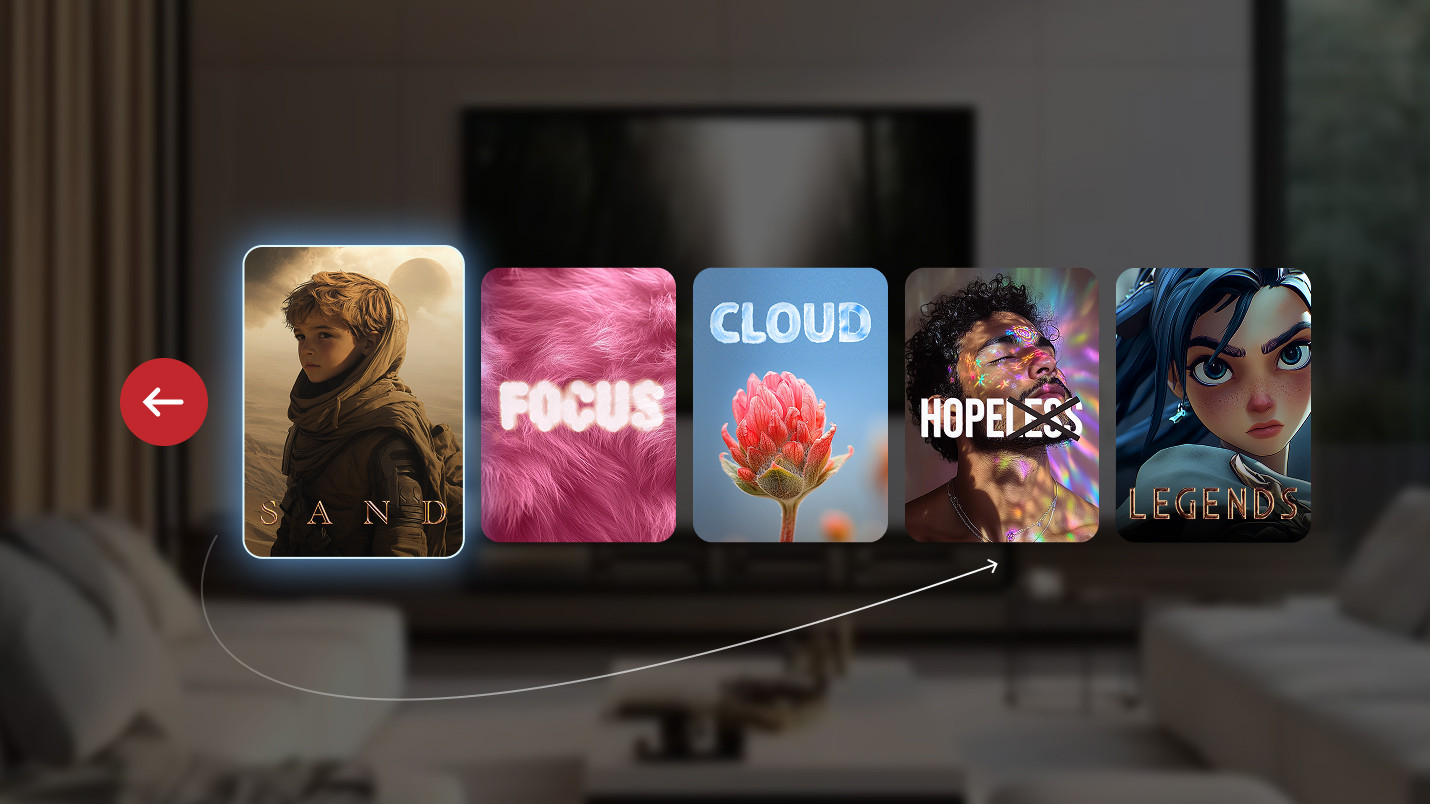
A familiar Apple TV screen comes to mind: a horizontal row of content cards laid out evenly across the screen, calm and balanced, with another row already visible below it. The composition reads as open and continuous, suggesting that movement should carry on naturally.
Navigation moves steadily from left to right until the last card receives focus. Another swipe or press to the right follows out of habit, yet nothing changes.
Structurally, there is nowhere else for focus to go. There is no focusable element positioned to the right, so focus remains where it is. The engine follows the structure precisely. For the user, the interaction feels abruptly cut short. The screen still shows content. The next row is already there. Momentum exists visually, but navigation responds with a hard stop.
Expert comment:
“When the product expects movement beyond that point, the layout alone stops being enough.”
The interaction itself works properly. However, the moment reveals a discrepancy between what the screen suggests and what the navigation allows.
Another variation of the same tension appears in carousels designed to feel endless. Cards repeat, spacing is consistent, and the first and last items look no different from the rest. Visually, the arrangement of the cards suggests circular motion, as if the content simply wraps around.
As the user lands on the first item and navigates left, they expect the focus to reappear on the last card. However, the interaction ends there, and the focus remains exactly where it started.
Alexey notes:
“As soon as you want focus to loop, you’ve already stepped outside what layout can express on its own. That behavior has to be defined, not assumed.”
Visual storytelling does not automatically translate into focus movement, even when the intended motion feels obvious on screen.
Think of a screen where the top row is clearly meant to anchor attention. The cards are larger, carry stronger contrast, and sit in a position that naturally reads as primary content. Everything about their presentation suggests that this is where the experience begins. Beneath that row, there is another set of elements, secondary in nature, smaller, calmer, and visually framed as a continuation rather than a parallel choice.
One element within that lower row is deliberately emphasized. It may be slightly larger, visually offset, or styled in a way that quietly suggests, “This is where you go next.” Although nothing is spelled out, the hierarchy is obvious when you look at the screen.
Now imagine navigating this layout with a remote. Focus rests on a featured item in the top row, and the user swipes down, expecting focus to move toward the element that the interface itself has been pointing at all along. Instead, focus drops to the element that happens to sit directly underneath in purely spatial terms, even though it carries less visual weight and less meaning in the flow of the screen.
Focus moves according to proximity and alignment, because those are the only signals available at that moment. Visual emphasis, editorial intent, and product priorities never factor into the decision.
Alexey explains:
“Focus has no notion of importance. It only knows what is visible, focusable, and closest in the hierarchy.”
The screen points the user one way, but focus quietly goes another, which means the user has to correct the course by hand. Focus remains consistent in its movement, and nothing appears broken, yet the experience starts asking the user to do extra work, correcting course manually to get back to what felt like the intended path.
Over time, these small moments start adding up. Individually they barely register, but taken together, they make navigation feel more demanding than expected, as the screen’s intent never fully carries through to focus movement.
During early demos, everything usually feels smooth enough to pass unnoticed, because navigation responds quickly and focus moves without resistance. The tension only reveals itself through repeated use, when small interactions start to accumulate.
After spending some time with the screen, you start to notice the same small moments repeating. You reach the edge and swipe/press out of habit. You wait for something to happen, then correct yourself. You pass the item you meant to select, circle back, and continue. Although everything functions properly, navigation slowly turns into work, requiring more attention than it should.
As Alexey puts it:
“For most screens, focus works on its own. We step in only when navigation is expected to jump rows, loop around, or follow a path that the layout alone doesn’t describe. That’s when Focus Engine becomes part of the work.”
The rules are still doing their job at this point, though the screen is prompting a different type of movement.
Focus Engine doesn’t show up much, but when it does, it’s usually because someone’s been searching for it. Typically, it appears after a screen has shipped, passed reviews, and proven that it works.
The trigger is often a small, almost insignificant observation. Someone navigates the same screen a few times and starts to notice their hands compensating: a press here, a correction there. The remote hesitates for a split second as it follows a slightly off path. Alexey describes these moments as surprisingly consistent across projects.
Expert comment:
“Most of the time, we don’t start with Focus Engine at all. We start with a feeling that something about navigation doesn’t match how the screen wants to be used.”
Sometimes, the mismatch is directional: a move that looks natural turns out to be impossible because the layout doesn’t allow for it. Sometimes, it’s about continuity: a row may look endless, but navigation can stop abruptly. Other times, it’s about participation: an element is clearly part of the experience, yet it never becomes part of the focal point.
Alexey explains:
“There are components that don’t enter the focus calculation by default. Images are a common example. They aren’t meant to receive focus, so the system skips them. If the product designer wants them to be interactive, we have to make that intent clear.”
Focus Engine is like a translator. The tvOS focus system already understands geometry, distance, and hierarchy, just not meaning unless someone takes the time to express it. What makes this tricky is that most of the heavy lifting happens out of sight.
Expert comment:
“From the outside, it can look like a small extension, just an API you touch when needed. But underneath, the engine is constantly calculating what’s on screen, where elements are, which direction the user moves, and what qualifies as a valid next step. There’s a lot of math and spatial logic happening that we usually never see.”
That hidden complexity is also why Focus Engine behaves so consistently before customization ever enters the picture. It already has a mental model of the screen. Customization simply reshapes that model in very specific places.
Alexey sums it up in a way that resonates well beyond code:
“Apple didn’t call it an engine by accident. It’s a system that’s always running. We don’t replace it. We just give it better directions when the product asks for a different route.”
From a business standpoint, this is rarely considered a technical task. Instead, it surfaces as usability feedback, such as longer navigation paths or the sense that an otherwise polished screen feels slightly tiring over time.
Knowing when and how to work with Apple’s tvOS Focus Engine turns these signals into targeted adjustments instead of layered fixes. This way, the navigation stays readable, the logic stays contained, and small changes won’t have unexpected consequences later on.
In Apple TV apps, focus is a bit like a current in the water. Most of the time, it carries the user forward without anyone thinking about it, quietly following the shape of the screen and the direction the interface suggests. As long as the channel is straight, the flow feels natural.
Bends appear as products grow. Screens begin to indicate movement that the layout alone cannot describe. Focus starts to bump into invisible edges and simply follows a channel that was never designed for the turn.
From our experience, tvOS Focus Engine works best when it is treated as a set of signposts, not a steering wheel. We let the system move freely where structure already makes sense, and we step in only where the experience starts asking for more than geometry can express.
This approach keeps the focus predictable, the navigation calm, and the interface intentional, even as it becomes richer and more demanding.
In the next part, we’ll move from understanding how tvOS Focus Engine works to exploring practical focus management patterns and real-world strategies that keep Apple TV navigation predictable as products grow in complexity.
If the focus behavior in your Apple TV app no longer matches how users actually move through the interface, it usually means the product has outgrown its initial structure. Working with a team experienced in tvOS app development services helps untangle focus logic, prevent structural dead ends, and keep navigation predictable as the interface continues to evolve.

tvOS Focus Engine is the built-in system Apple uses to control how focus moves across interface elements on Apple TV when a user navigates with a remote. It interprets layout structure, visibility, and spatial relationships to decide where focus goes next, working automatically with standard UI components and becoming configurable only when interface intent goes beyond what layout alone can express.
tvOS focus navigation follows geometry first. Focus moves to the nearest eligible element in the direction of the remote input, based on alignment and proximity. This works naturally for simple, well-structured screens. When navigation is expected to loop, jump rows, skip elements, or follow visual priority instead of strict geometry, developers guide focus explicitly using Focus Engine APIs to align navigation with how the screen is meant to be explored.

