





This website uses cookies to help improve your user experience

There’s a particular kind of satisfaction to navigating an Apple TV app with a good remote. Focus moves one step at a time: right, down, across. And when the layout is well-structured, you stop tracking the white outline and start thinking about what you’re watching. The interface disappears, which is exactly what it’s supposed to do.
The opposite is also true. When something is slightly off (a jump that lands one row too far, a reset after a data refresh, a swipe that doesn’t go where you expected), you notice it before you can name it. The remote starts to feel like it needs to be negotiated with instead of just used.
In the first part of this guide, we explored how that calm is built. We covered how the tvOS Focus Engine reads geometry, hierarchy, and visibility, and how navigation follows structure with steady confidence for as long as the layout speaks clearly enough on its own.
This second part moves from understanding to behavior. As screens grow denser and priorities become less symmetrical, the quiet agreement between layout and movement begins to thin: a banner stretches wider than the rest, two buttons sit side by side yet carry different weight, a carousel hints that the end is not an end at all. The interface starts implying direction beyond straight lines.
Apple TV Focus management lives in that narrow space between structure and meaning. What follows is a closer look at tvOS Focus best practices drawn from real projects. We’ll discuss the patterns that keep navigation aligned with intent as complexity increases, and the decisions that prevent the small white outline from drifting away from the story the screen is trying to tell.

The reflections in this part grow out of two things: our own work on Apple TV products and countless practical conversations with Alexey Rossennik, iOS Tech Lead at Oxagile, who has spent years shaping focus behavior in real tvOS app development projects.
Key takeaways:
What follows is not a checklist copied from documentation. It is a collection of patterns that keep repeating across different apps, different teams, and different product stages.
When people ask about tvOS Focus best practices, they usually expect something technical: a list of APIs, a set of rules, or a diagram. In reality, most focus decisions begin in a meeting room long before anyone opens Xcode.
Picture a design review: a screen that looks stunning on the big monitor, a wide hero banner stretching across the top, and below it sit two buttons, visually paired, both balanced in size and weight. Further down is a row of smaller tiles that continues the design.
With a laptop cursor, this layout feels intuitive. You can access what you need directly. On Apple TV, the journey is directional. You don’t point at the button, you step toward it.
Press down. Where does focus go? If that question was not discussed when the layout was approved, the answer might surprise someone later.
Alexey often puts it plainly:
“Most of the time, the conflict isn’t about bad design or bad code. It’s about assumptions. Someone imagined how movement would feel, but nobody actually walked through it with a remote before locking the structure. And by the time someone does, it’s already expensive to change.”
Our projects showed that teams who asked simple questions early had the most stable navigation patterns:
Walking through these paths with a remote even on a prototype reveals problems before they become structural issues.
The tvOS Focus Engine interprets geometry consistently. Instead of fighting that consistency, it’s better to design with it in mind. When visual intent and directional movement are considered together from the beginning, focus typically doesn’t require significant adjustments later on.
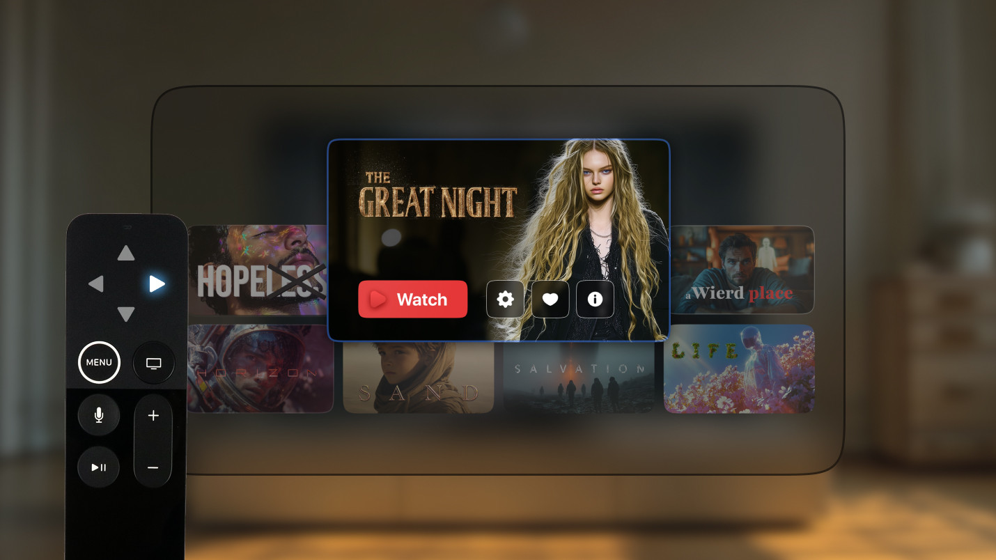
One of the most common patterns we see is over-enthusiasm. Designs become richer, and cards become layered. Icons, badges, labels, and background elements all start to look interactive. On a static design, it feels dynamic and detailed, but on a real TV screen, it turns into chaos.
We have worked on screens where a single content tile contained four or five separate focusable elements. A right arrow press or swipe might move the focus into a tiny icon inside the current card instead of moving to the next movie. Technically valid, but disorienting to use.
Alexey’s take:
“On TV, fewer focusable elements usually mean better control. If everything can receive focus, nothing feels important.”
Apple TV Focus management is not about making more things interactive. It is about deciding what truly deserves attention and what should remain in the background.
Another pattern appears after dynamic content updates. The app refreshes the data, the rows reorder, and a new banner loads. Everything renders correctly, but focus suddenly lands somewhere unexpected: sometimes back to the first row, sometimes to the top of the screen entirely.
We had a case where every content refresh pushed the user back to the first item in the grid. Imagine browsing the third row of recommendations and being sent back to the beginning each time new data arrives. Nothing crashes. Nothing freezes. But the experience is disorienting in a way that’s hard to shake.
Focus persistence is one of those tvOS Focus best practices that rarely gets discussed early, yet its absence is felt immediately.
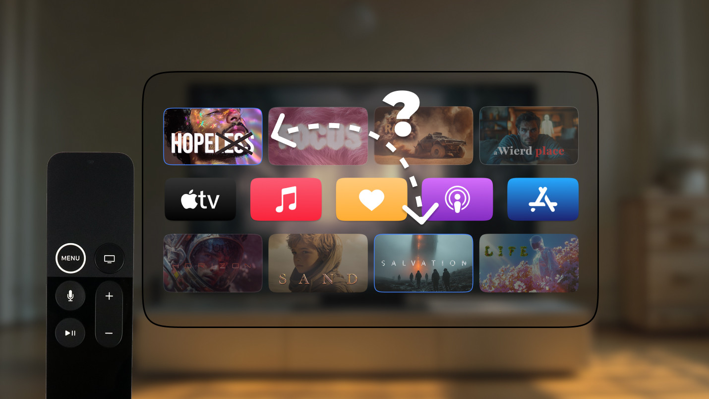
There is a basic expectation on TV: swipe down, focus moves down. Press right, it moves right.
That expectation forms within seconds. Things start to go wrong when layout complexity interferes with that mental model. Uneven spacing, nested containers, and custom overrides can cause focus to jump diagonally or skip an element entirely.
As Alexey explains:
“Users build a mental map of the screen very quickly, sometimes within the first two or three presses. If focus suddenly jumps somewhere that doesn’t match the swipe direction, that map collapses, and they lose confidence in the interface. After that, every press becomes tentative.”
We have seen cases where a single misaligned container caused focus to jump randomly between rows. Under the hood it was simply geometry doing its job, but on the surface, it felt broken.
In rare cases, behavior differences appeared between OS versions and between UIKit and SwiftUI implementations. Same layout, different focus response. These situations require careful testing and sometimes call for compromise instead of perfection.
Some situations are not bugs, they are design dilemmas. Imagine a large, featured tile at the top of the screen. Below it are two smaller buttons: “Play” and “Replay”. Visually, both are grouped under the hero content.
When the user swipes down from the hero, where should the focus land?
If it always lands on the left button, users who prefer the right one need an extra press. If it defaults to the right, others compensate instead.
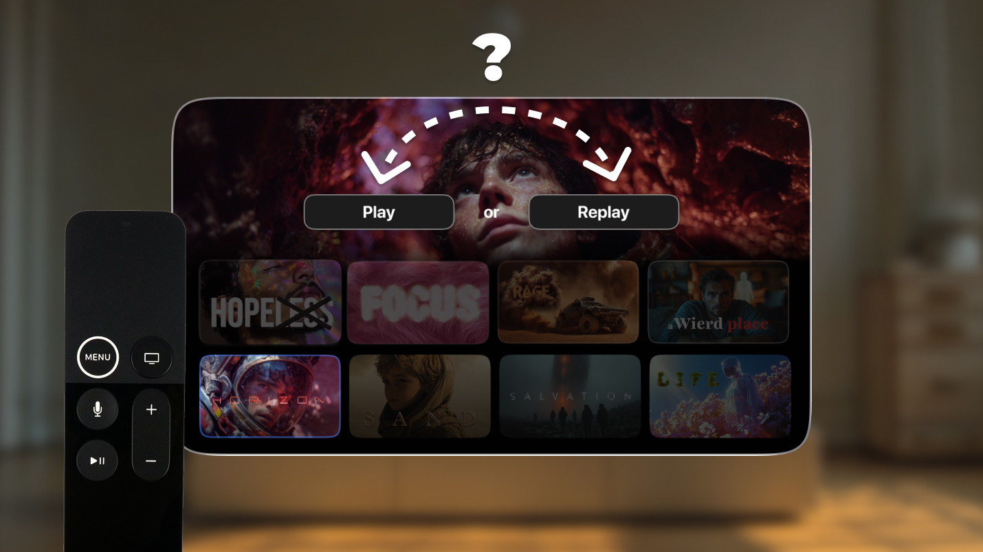
Apple TV Focus management shifts from rules to evidence in these moments. We have resolved similar cases through A/B testing, releasing two variations and observing real navigation patterns. If data shows that most users choose “Play” first, then the focus should reflect that behavior.
The metrics that matter most in these tests are not complicated:
In one case, the majority of users consistently swiped directly to “Play” regardless of where focus defaulted. That single data point was enough, as defaulting focus there reduced navigation effort for most people without meaningfully affecting the rest.
That kind of data removes the guesswork from what otherwise feels like an arbitrary decision. When two choices seem equally valid, real usage patterns usually aren’t equal at all. The numbers tend to point clearly in one direction, and once they do, the focus decision makes itself.
Not every issue is philosophical, and treating a bug like a design dilemma wastes time in both directions.
Here is a practical way to tell them apart. If focus skips an element that should clearly be next (for example, swiping down once lands on the third cell instead of the second), that is almost always an implementation error: a constraint is wrong, a container is misreporting its size, or a framework inconsistency is producing unexpected geometry. The fix is in the code, not the layout.
If focus lands somewhere that is geometrically correct but feels wrong given what the screen is communicating. For example, when a secondary action consistently intercepts focus before the primary one, that is a design issue. The geometry is doing its job accurately. The problem is that the layout isn’t expressing priority clearly enough for the engine to reflect it.
We had one case that looked like a routing bug for days. Focus was jumping unpredictably between rows on a content grid. It turned out that a container had slightly inconsistent padding on one side, which caused the engine to calculate a closer neighbor than intended.
The fix took twenty minutes once we understood the actual cause, but it took much longer to get there because the team kept adjusting layouts that weren’t the source of the issue.
Alexey’s approach:
“First, figure out whether it’s a design problem or a code problem. They need different fixes, and confusing one for the other just delays both.”
A pattern runs through all five of these situations: focus issues rarely announce themselves loudly. Users don’t describe navigation in technical terms. They just quietly press more buttons, hesitate, or leave. The cost of poor focus management is invisible in demos and shows up in behavior over time.
We’ve shipped Smart TV products across streaming, media, and entertainment, and focus is one of the first things we get right. Whether you’re starting from scratch or untangling an existing app, our team brings the experience to make navigation feel invisible.
The patterns below come from real production work: screens that shipped, evolved, broke expectations, and were refined again. These are not theoretical principles. They are the decisions that consistently separate calm navigation from chaotic navigation.
One of the strongest Apple TV Focus management principles sounds almost boring, yet it saves more time than any customization ever will: build the layout so that default geometry already produces the right movement.
We have seen projects where focus behavior was heavily customized to compensate for layout decisions that could have been solved structurally. Slight misalignments, uneven spacing, inconsistent grouping, or visually stacked elements that were not actually aligned in hierarchy often forced manual overrides later.
Alexey points this out early in reviews:
“If the layout is clean and the hierarchy is obvious, the tvOS Focus Engine rarely needs help. The custom logic almost always appears in places where the visual design and the actual structure have drifted apart. And usually nobody notices until someone picks up a remote.”
The more the hierarchy matches what the eye perceives as rows, columns, and priority blocks, the more the engine behaves as expected without intervention. Customization should refine behavior, not rescue it.
Attention on TV moves step by step. Unlike touch devices, where users can jump directly to any point on the screen, the remote moves across intermediate positions.
When there are too many focusable elements, navigation becomes dense. Users may press right expecting to reach the next card, but instead land on a badge, then an icon, then a nested button inside the same component.
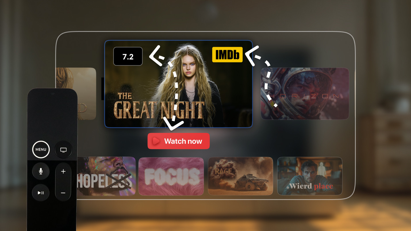
We have audited screens where nearly every decorative element had accidentally become focusable. From a development standpoint, this happens easily. From a user standpoint, it feels like walking through tall grass.
Alexey explains:
“TV navigation benefits from clarity. If everything can receive focus, the path loses definition.”
The best tvOS focus strategies often start with subtraction, not addition.
Users quickly build an internal map of the screen. If they open a detail page from the third card in the second row, they expect to return to that same position.
Failing to preserve focus state after transitions or data updates quietly destroys trust. The interface may reload correctly, but if focus resets to the top of the screen, users have to reorient themselves every time.
We have seen this most frequently in content-heavy streaming apps, where data refreshes or dynamic inserts disrupt focus continuity.
Good Apple TV Focus management keeps track of the origin. When possible, return users exactly where they left off. It reduces navigation effort and feels respectful of their time.
Elements can be close together on screen, but not equally important. If focus follows position instead of priority, the product may highlight the wrong action. There are two situations where this happens regularly.
Imagine a hero banner with two buttons beneath it. One drives the main action, the other is secondary. If focus defaults to the leftmost or nearest element, users may land on the less important choice first.
As Alexey frames it:
“When layout alone doesn’t express priority clearly, we guide focus deliberately. The goal isn’t to override everything, only to clarify the path.”
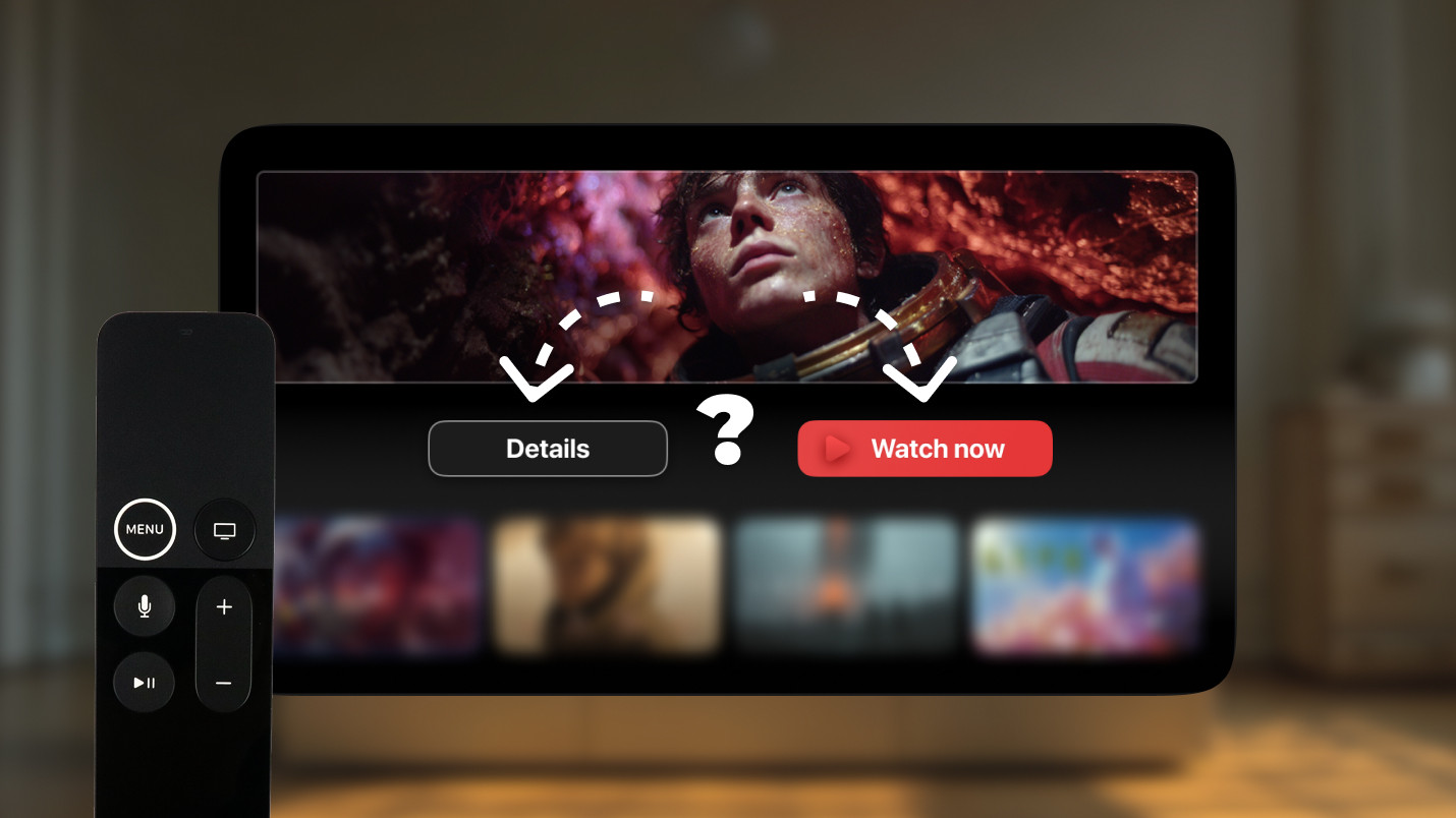
A featured tile with two smaller buttons below it. A swipe down could reasonably land on either one. Which should receive focus first?
Instinct is not always enough here. In similar cases, teams have tested navigation variants and measured real interaction patterns. If most users consistently reach for “Play” first, focus should default there. When hierarchy is unclear, behavior provides the answer.
What feels like acceptable navigation in a desktop simulator may feel different on an actual television in a dim room with a physical remote. Distance and response timing matter. Minor focus jumps become noticeably more disruptive in real living room conditions.
We have encountered differences between UIKit and SwiftUI implementations of focus behavior, and occasional OS-specific inconsistencies that only surfaced on devices.
Alexey’s note on this:
“Under the hood, the engine always calculates geometry. But the way frameworks expose that behavior can differ. Real-device testing reveals things that simulators don’t.”
Most focus-related problems do not come from poor Apple TV app development. They emerge from assumptions carried over from other platforms.
Design decisions that work well on the web or mobile can result in complicated navigation on TV. A designer groups elements based on meaning, even though spatially they belong to different rows. A layout visually emphasizes one path while the geometry points elsewhere.
Alexey notes:
“If the designer and developer have more experience with web and mobile than with TV, it can be hard to predict what will feel right. The remote changes how you think about hierarchy.”
Discussing focus during wireframes is far less expensive than rewriting navigation logic after release. Having those conversations early, even simple ones, with a prototype and a remote, consistently prevents the largest problems.
Users almost never talk about focus when it works. What changes instead is how they move: fewer corrective swipes, fewer moments where the remote feels like it needs to be negotiated with. Interaction simply flows.
The best indicator that focus is working? Nobody mentions it. Navigation becomes invisible, and the content takes over.
In our experience, tvOS Focus best practices are not usually complex tricks. They are about consistency, restraint, and alignment between design, product intent, and the actual movement on screen.
When that alignment is right, the app feels settled. Users stop thinking about the remote and start thinking about what they’re watching. That quiet ease is usually the real benchmark.
The goal is not to control the engine, but to keep intention and movement in harmony. When that alignment is there, navigation does not call attention to itself. It just sounds right.
Good focus behavior rarely comes from a single brilliant decision. It comes from consistently applying a small number of principles throughout design and development. The table below distills those principles into a format you can return to during reviews, handoffs, or QA.
| Principle | What it means in practice |
| Make focusable areas large and predictable | Elements that receive focus have to be easy to reach and visually distinct. Avoid making interactive targets small or clustered, as small targets are harder to track and easier to miss on a TV screen viewed from across a room. |
| One screen, one primary focus logic | Each screen needs a clear hierarchy: one main action, one natural entry point, one logical path through the content. If a screen has two or three competing primary flows, focus will feel ambiguous no matter how carefully it’s tuned. |
| Minimize focus dead ends | Users must never find themselves stuck with no obvious next step. Every focusable region has to connect logically to what surrounds it. If the user reaches an edge, it must be clear where the remote will take them next. |
| Keep the user oriented | Focus position should be preserved across transitions, data refreshes, and modal closures where possible. Resetting to the top of the screen after every state change makes users re-navigate content they’ve already passed through. |
| Hierarchy over aesthetics | The primary action has to be reachable within one or two presses from the natural entry point. Secondary elements like filters, options, and supplementary controls cannot intercept focus on the way there. If they do, the visual hierarchy and the navigation hierarchy are out of sync. |
| Swipe direction should match focus direction | When a user swipes right, focus must move right. When they swipe down, it should move down. Any deviation like diagonal jumps, skipped rows, or unexpected resets, breaks the mental model users form within the first few seconds of using a screen. |
| Test on a real device, in a real room | Simulators don’t replicate the physical distance, the remote latency, or the experience of navigating a screen you’re not sitting directly in front of. Small focus issues that feel minor on a laptop become genuinely disruptive on a television. |
Alexey’s perspective on where these principles actually come from:
“There are guidelines Apple has published, and they cover a lot of this clearly. When I give advice on a project, I’m usually grounding it in those guidelines because you need some authority to point to beyond personal preference. If I see something that doesn’t feel right, the first thing I do is check what the guidelines say about it.
The second layer is UX. Some people have done more research and run more user studies than any single developer has time for. Their conclusions are already baked into the guidelines.
And then there’s the most important thing: use the app yourself. You can debate how focus should behave in the abstract, but the moment you sit down with the remote and actually navigate through it, the answers usually become obvious.”
Apple TV focus management isn’t usually about clever overrides or custom logic. Most of the time, it’s about making sure the layout’s visual logic and its geometric reality say the same thing. When they do, the engine follows naturally, and there’s nothing left to fix.
Alexey summarizes:
“Sometimes the best decision is to do nothing. If the layout is clean and logical, the engine already knows how to move. Problems usually start when we try to fix something that isn’t actually broken.”
If navigation on Apple TV were music, then Focus Engine would be the instrument, not the melody. Your job is just to keep the score clear enough that it knows what to play.
Focus issues are easier to prevent than to fix. If your team is designing or developing a tvOS product and wants navigation to feel right from the start, we’ve been there many times across streaming apps, content platforms, and everything in between.
1. App Programming Guide for tvOS — Apple Inc.
Apple TV focus management controls how the highlighted focus state moves across interactive elements on tvOS. With no touchscreen or cursor, users navigate entirely through directional swipes on the Siri Remote. The Focus Engine determines which element receives focus next based on geometry, hierarchy, and layout structure1. Managing focus well means users never feel lost or stuck.
The most consistent tvOS focus best practices across real production apps come down to a few core principles:
Beyond that, the most overlooked practice is the simplest one: walk through every screen with a physical remote before locking the design. Most focus problems are obvious the moment someone actually navigates through them.

