


This website uses cookies to help improve your user experience


“Accessibility is not a feature, it is a social trend.” — Antonio Santos
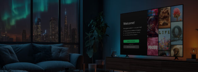
But before we start…
Streaming has long become the new public square, where culture is consumed, voices are exchanged, and identities are affirmed. And just like a real square, when it has stairs but no ramp (literal or digital) it stops being truly public.
Today, building on our extensive project experience, we’ll go into the hands-on side of accessibility in software development and how content platforms can close the inclusion gap.
But first let’s pause to slice the word “accessibility” to see what it’s made of, and what we mean when we sit down with clients and talk about making their app usable by anyone.
Accessibility, as we see it at Oxagile, is a puzzle with two interlocking pieces. The first piece focuses on the structure, clarity, and design of the user interface itself:
The second involves the direct tools and enhancements that make content usable and enjoyable for viewers with sensory or motor impairments:
In this article, we explore both sides of the accessibility puzzle: how to embed these design principles into a modern interface without trading elegance for distraction, and the structural challenges the process entails. From there, we look at the practical features that can be introduced smoothly into your video platform with minimal disruption.

To shed more light on how accessibility decisions evolve inside real projects, we spoke with Yury Dyakov, a UI/UX Designer at Oxagile, who’s been deeply involved in shaping accessible streaming interfaces.

And to see how broad intentions like “This should be clear to everyone” translate into the grounded reality of cross-platform functionality, we turned to the hands-on experience of Olga Lapitskaya, Project Manager and Business Analyst at Oxagile.
Key takeaways:
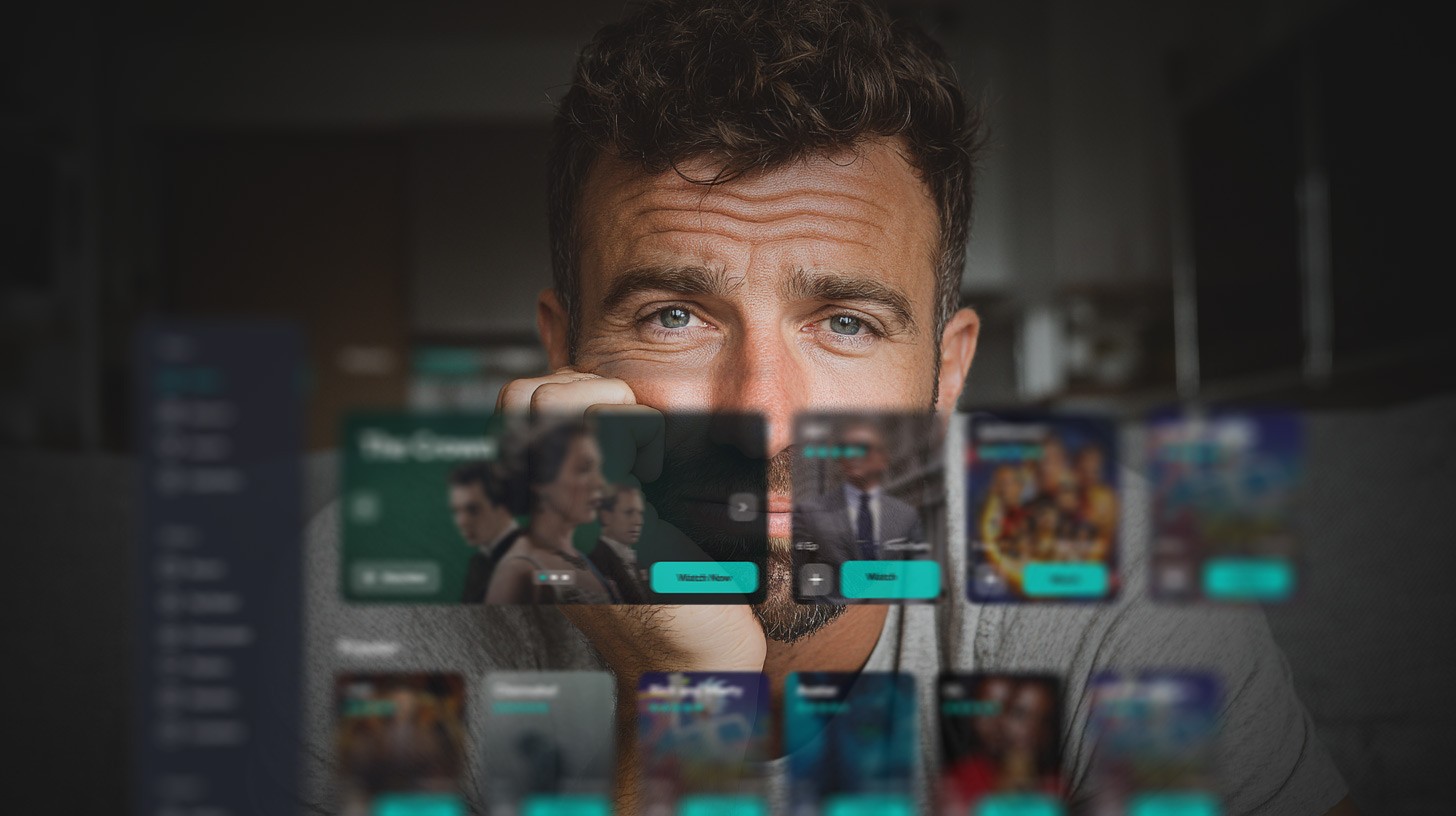
A quiet evening, a cup of tea, a playlist queued, and a few small, scattered icons. A viewer squints, taps the wrong one, and the story slips away. For most of us, that’s a tiny nuisance. For someone with low vision, it’s a recurring eviction notice from an experience billed as “for everyone”.
This article will approach user interface accessibility in video applications not as a charitable enhancement, but as a fundamental pillar of thoughtful design. As an approach to design that lets everyone walk through the front door without stumbling over the welcome mat.
In our projects, we frequently collaborate with clients ranging from nonprofit public broadcasters to large streaming platforms, all of whom share a noble desire to build digital experiences that reflect the diversity of their audiences.
As one of our clients even put it, “Make every story we tell visible, audible, and understandable to everyone.” No one left out, no one squinting in frustration.
However, and that’s what we’ll be discussing further, there’s still a persistent myth that accessibility can wreck the aesthetic or slow down the experience.
The reality is the reverse.
Design choices made, for instance, to help visually impaired viewers, like sharper contrast, fewer friction points, clearer hierarchy, larger type, don’t just rescue one audience, they polish the usability of the whole product. And better usability quietly fuels what every platform cares about most: higher session times, stronger engagement, lower churn.
Add the regulatory nudge of laws and standards, and accessibility is no longer just a courtesy or a polite gesture.
Then what is it, after all?
When you build a streaming platform, every button, caption, and layout becomes part of someone’s daily ritual. The question is simple: how do you make that ritual effortless for everyone? Literally.
Over the years, our teams have explored nearly every corner of video UI and UX. And if the word “accessibility” makes you picture a single add-on feature like a text-to-speech toggle, a larger font button, keep reading. We build those, yes, and they matter deeply. But true accessibility is a layered design philosophy.
Highcontrast palettes, generous type, roomy touch targets, and a clean visual hierarchy aren’t just niceties for people who navigate by sight. They make interfaces readable, scannable, and reliable for viewers who rely on memory, touch, or assistive tech.
Captions, transcripts, and audio descriptions are not checkpoints to be rushed, they’re storytelling tools. Thoughtful captions are adjustable in size and background opacity and can be repositioned; transcripts are searchable conversation maps; audio descriptions narrate expressions, gestures, and scene changes without interrupting the flow. Done right, these features enrich the story rather than interrupt it.
Context matters. People don’t always watch with full attention: they cook, commute, multitask, or fall asleep midepisode. Keyboard navigation, screenreader compatibility, voice commands, and generous tap zones create flexible ways to interact. Adding a “Play next” voice command or reliable remote-control navigation helps users with limited mobility and makes the product simply more usable for everyone.
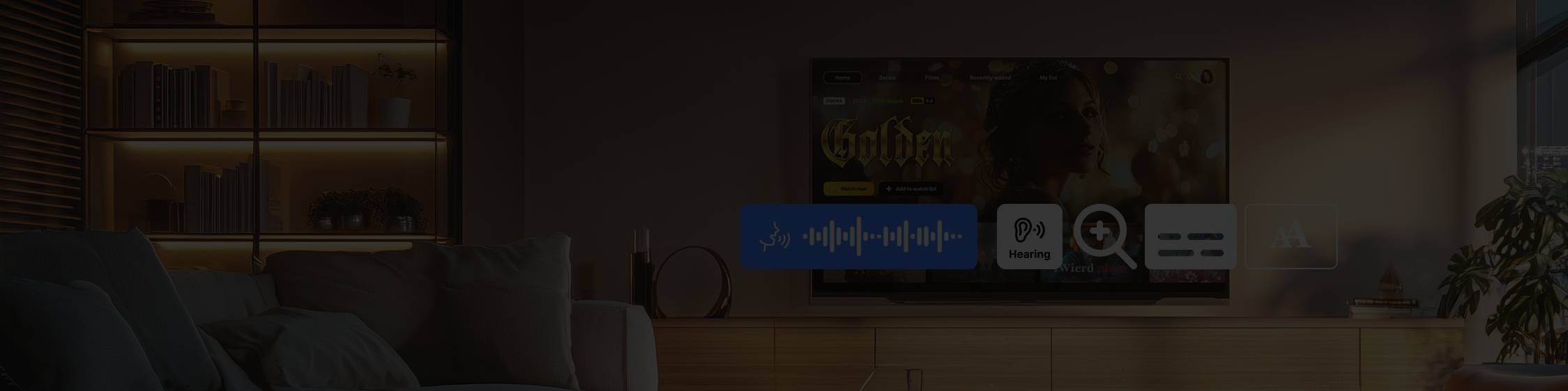
While enhancing a multitenant video streaming platform, our team addressed a new requirement: meeting WCAG and ADA accessibility standards without compromising elegance or ease of use.
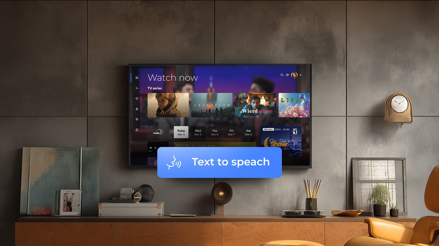
We rolled out a text-to-speech feature across Apple, Android, Roku, Amazon Fire TV, and Samsung TV that instantly converts on-screen text from titles, descriptions, buttons, and metadata into natural, human-like audio.
Key wins:
Accessibility didn’t just tick a legal box. It amplified the product’s usability, reach, and reputation.
Accessibility lives in categories that together define the viewer experience:
These are technical patterns, but they begin long before code. Good accessibility in UI/UX design starts with understanding how people scan, pause, and return to a story, and then translating those habits into design choices that feel natural and indispensable.
Designing for inclusivity is as much an organizational task as a creative one. Aligning business goals, UX strategy, and inclusive user interface design requires advocating changes that sometimes touch core interface components.
Because when a product already looks polished, even slight redesigns can be hard to accept and may seem to strip away its appeal. However, many features and changes aimed at better accessibility clearly communicate their business value when you view the whole picture. Now let’s take a closer look at how to approach designing for accessibility in UX and aligning it with your vision.
Implementing UI accessibility for video apps rarely fails because of technical skills. With experienced engineers, adding a feature or tweaking an interface is usually straightforward.
Through Yury’s lens:
“If implementation issues arise during development, it usually means something went wrong earlier. I try to foresee them at the design stage, for instance, a component that might need an expensive API or special data, and I clarify it right away with the team or the client. Of course, not everything can be predicted. But most nuances can be solved before they reach production if you stay collaborative.”
So the challenge seldom lies in implementation once the designer has planned it carefully. And it’s not the tools either.
As Yury frames it:
“These days, the toolset is so rich that there’s always a way to solve a problem, sometimes even by fixing legacy issues that had been sitting in the product for a while. We find simple workarounds, or I might, for instance, optimize the animation with tooling to minimize its size in the codebase.”
The major challenge is turning accessibility into a business advantage. Not only interpreting “user needs” correctly, but also treating accessibility not as a cost but as a catalyst for better UX. That requires alignment across product, design, and business priorities.
To make this concrete, let’s walk through a live project from our extensive practice, a case that brings the businessUX dilemma into sharp relief.
One of our clients already had a sleek, featuredense interface: modern animations, layered menus, subtle icons, and lots of micro interactions. Visually it communicated innovation.
The problem was audience mismatch, as a large portion of their users were older adults.
And those users weren’t navigating the interface the way the client expected. For them, the sleek multi-layered design filled with overlapping menus, subtle icons, and micro-interactions often became confusing. Important elements blended together and calls to action were missed. Pages that looked modern and trendy, turned out to be dense and overwhelming to people who simply wanted to browse their favorite channels.
And here’s where the business-UX dilemma revealed itself.
On the one hand, the client wanted to support their diverse older audience. On the other, they were strategically focused on attracting a younger demographic, eager to show that their app could compete with major streaming platforms in terms of design and sophistication.
In Yury’s view:
“The client’s team wanted to keep every feature visible, which led to visual overload. Simplifying it for accessibility felt to them like giving up the very modernity that defined their brand. Our task was to prove that UX accessibility doesn’t mean compromise, but rather evolution. We knew we couldn’t just remove elements as that would make the client feel like they’d become “less premium” to the users. So, we had to show, not tell.”
The approach was patience, evidence, and gradual alignment.
Yury hits on a critical nuance:
“Of course, we can’t enforce our own vision on the client. What we can offer is our expertise and let them make an informed choice. Because design isn’t about imposing taste, it’s about reasoning.”
We never frame changes as “this looks nicer”. Aesthetic judgments are subjective and clients will naturally prefer their own designs. So what we do instead is present objective, measurable benefits, such as fewer user clicks, more efficient flows, or improved task completion rates.
Yury’s perspective is clear-cut:
“When you show real data, testing results, or proven design research from industry leaders, that’s when the conversation shifts from opinion to evidence. So in this case we presented research that was validated and reliable, and began developing interactive mockups — fully clickable, fully functional. At first, the client was hesitant as the designs looked unfamiliar. But we kept refining, testing, showing real use cases. And gradually, they started to see the potential.”
When every design choice is grounded in proof rather than preference, effective design discussions are not about aesthetics but about outcomes.
When a design update arrives (whether a ground-up rebuild for TV or an incremental refresh) the easy choice is to copy the new layout across every device. Tempting as it is, that approach fails the user. True adaptation means rethinking how the experience lives and breathes on each device.
As Yury breaks it down:
“You can’t just take a desktop version, shrink it down, and assume it will work on mobile. A proper adaptation requires reimagining navigation, hierarchy, and interaction patterns for each platform, because what feels natural on a TV remote will never feel the same on a smartphone or tablet.”
Budget and timing matter, and it’s reasonable to factor them in. Even so, you can make deliberate choices: prioritize the scenarios that define the product experience and make sure those flows work seamlessly everywhere.
Yury’s take here is direct:
“In well-designed systems, you’re translating a single product idea into different interaction languages. For TV, design for distant viewing and remote control; for mobile, for one hand vertical browsing and gestures; for web, for deep discovery and keyboard use.
Therefore, during every project (including the current example) we always prioritize core scenarios like play/resume, search, and subtitles, and tailor layout, navigation, and accessibility so each platform feels native rather than a scaled copy.”

Treat UX and UI as engineering disciplines: measurable, testable, and rooted in outcomes, not opinions.
Once we reached mutual understanding, everything clicked. Together with the client, we redesigned the most complex screens. Not by stripping features, but by rebalancing focus.
In some cases, we simply enlarge fonts to make them easier to read. But for some screens, we completely redesign them from scratch. Remove the navigation noise that regular users don’t need, focus only on what truly matters, and significantly increase the UI contrast, so users can clearly distinguish clickable elements from non-clickable ones.
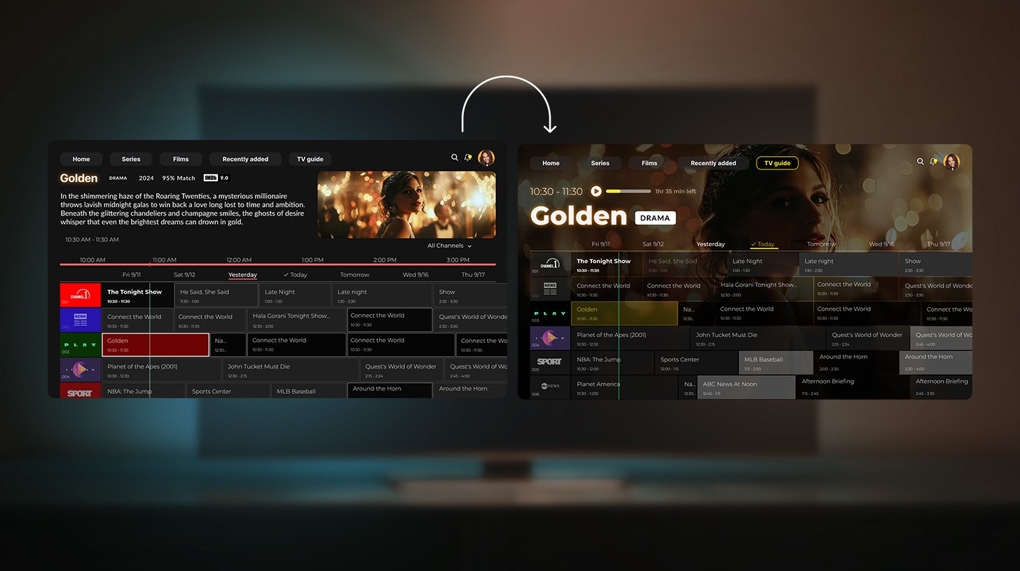
One of the most striking examples in the recent case we’re talking about was the EPG screen, forming the core of the viewing experience.
Yury comments:
“When I joined the project, the EPG page had two filters, one on the left and one on the right. It looked advanced, but once we ran usability tests, we found almost no one used those filters. Meanwhile, users were complaining that navigation felt overcomplicated.”
And the team began simplifying — step by step, iteration by iteration, conversation by conversation. After a series of revisions, discussions, and user tests, we arrived at a clean, minimalistic, and intuitive interface.
Yury’s assessment:
“The result wasn’t just a design for users with visual impairments. It was a design that felt lighter and more natural for everyone.”
But simplification alone wasn’t enough. Various audiences had genuinely separate needs, and the team wanted to respect that diversity.
Yury sums up the experience:
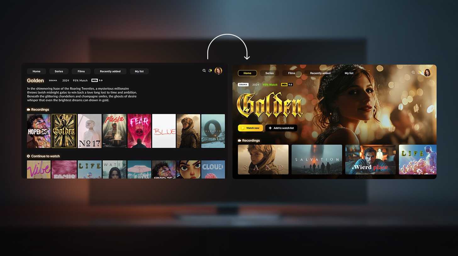
“We started working on a compromise solution. We created two different page versions for two audience segments, both reachable via the main menu. The accessibility feature itself is also placed in the menu and offers three scaling options.
Those scaling levels (small, medium, and large) let users adjust both font and UI size according to their comfort.
The enlarged text can’t just be “larger”. It needs to scale properly, to a certain degree, and then even more if needed. That’s why we built three distinct scaling levels.
In parallel, we created another interface focused entirely on older users. We rethought the original overloaded design, made it modern and minimalistic, and developed a separate version specifically for their cognitive habits — essentially, the way they’re used to browsing TV channels”.
In other words, the design evolved from a one-size-fits-all solution into an adaptive experience, one that met users where they are. Because accessibility in video streaming platforms doesn’t compete with innovation or aesthetics.
Now let’s narrow the lens and zoom in on one specific feature. Because once you’ve decoded the mechanics that make a single implementation work, scaling others starts feeling like you’ve found the cheat code for accessibility logic.
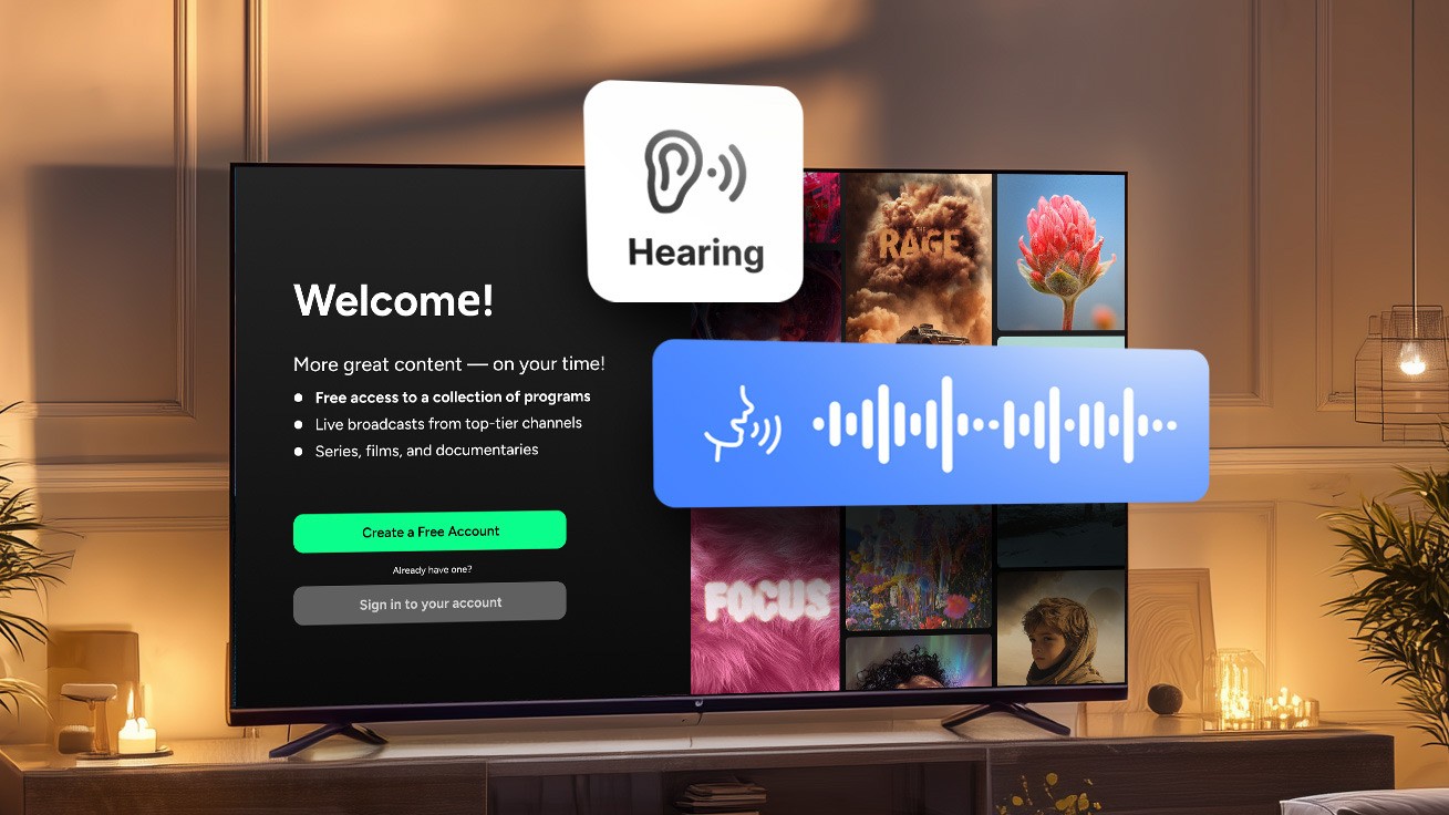
Here’s our recent story of embedding a text-to-speech (TTS) feature into a streaming app and reaching the goal most of our clients approach us with: making it fade into the background and just work.
This feature was designed for users with visual impairments, and the concept was straightforward: help users understand where they are, what content is available, and how to start playback.
As Olga points out:
“In essence, we wanted users to consume not just the video, but the app experience itself through audio. But for that to happen, the feature had to do more than just read out labels.
It needed to vocalize everything: navigation elements, content cards, playback controls, modal dialogs, error states, and even contextual metadata like genre, duration, and availability. And, of course, everything had to work flawlessly. No half measures.”
That’s why, from day one, Oxagile’s team zeroed in on two essential stages that define every video streaming accessibility build. And since ignoring them doesn’t save time but rather guarantees fragility of the system, we’re more than ready to show you what these stages are and what happens when you don’t cut corners.
The first stage includes designing a feature with real expansion in mind, making sure it can grow across platforms and screens without falling apart in translation. After all, the ambition to make content accessible on any device isn’t just about good karma. It’s about good business. It means a broader audience, stronger engagement, and lasting loyalty from users.
But delivering accessibility features across the fragmented ecosystem of video platforms is a complex technical task that goes well beyond UI adjustments. Each environment — Apple mobile and TV, Android mobile and TV, Roku, Amazon Fire TV, and Samsung Smart TV — follows its own logic for rendering, input handling, and accessibility support.
In Olga’s opinion:
“For example, what counts as a “focusable element” in Android TV does not behave the same way in Roku’s SceneGraph framework or Samsung’s Tizen environment. Voice navigation and screen reader functionality differ in both implementation and capability: while Apple provides system-level APIs for VoiceOver, Roku and Fire TV require developers to build and maintain their own accessibility layers.”
Even the smallest interface adjustments, such as focus order or caption synchronization, must be tested separately for each device family. What behaves perfectly on an iPhone might break navigation flow on a smart TV controlled by a directional remote. Maintaining parity of experience across all platforms often means creating and adding new components, not simply reusing them.
And then comes the orchestration: managing deployments across multiple ecosystems, SDK versions, and store certification pipelines — each with its own compliance and performance checks.
So what’s the winning formula? A hybrid approach: unified architecture where it makes sense, localized engineering where it doesn’t. One codebase when possible, handcrafted adaptation when necessary.
And no, don’t be intimidated by what sounds like a mountain of complexity. It is actually a series of manageable design decisions. At Oxagile, we have repeatedly translated this into practice across hundreds of multiscreen solutions. The goal is not a “write once, ship everywhere” credo but a disciplined, environmentaware approach that makes accessibility feel native, reliable, and invisible to the end user.
Initially, the plan was to have a unified business logic across all platforms — a strategy that had often saved the client time, as in the case of the modular OTT solution. That project relied on a modular architecture that enabled quick customization, scalability, and efficient adaptation to diverse market needs through a single, reusable codebase.
Similarly, the new project began with the same principle: the application was built with React Native, which made cross-platform development highly efficient for most standard features. However, when the client requested accessibility support, it quickly became evident that React Native’s built-in tools did not deliver consistent results across platforms.
From Olga’s perspective:
“While the text-to-speech feature on mobile devices could be fine-tuned with minor adjustments, on platforms such as Fire TV, Amazon Fire TV, Samsung TVs, Android TV, and Apple TV, it proved unreliable. So we had to write separate native implementations for each platform to make accessibility mode work properly.”
In practical terms, this meant stepping away from the initial single codebase strategy. Each platform required its own native modules and custom bridging between React Native and the underlying operating system APIs. Even though Fire TV is based on Android, its custom OS layer and input methods introduced additional complexity, preventing reuse of the existing Android code.
In the end, the team had to go far beyond React Native’s comfort zone, exploring each platform’s native layer to make accessibility work seamlessly. It meant extra effort and meticulous tuning, but the result was worth it: a truly inclusive experience that felt natural on every device, from mobile to smart TV.
You try to grab it — map out the right components, scope it, implement it — it slips?
We’ll guide you on the right tooling, framing and approach to make accessibility something solid that fits (and holds) perfectly into your product’s architecture and into every user’s screen.
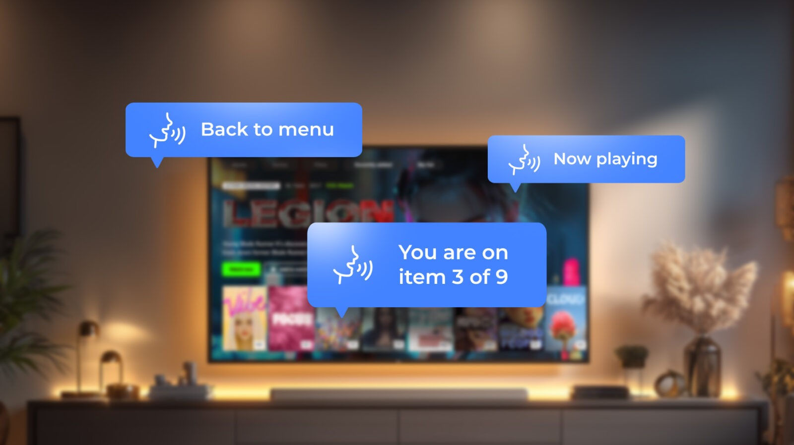
After integrating the text-to-speech engine, we entered a meticulous testing phase. Every navigation action should trigger a spoken cue: “You are on item 3 of 9,” “Now playing,” “Back to menu.” The challenge was ensuring these cues fired precisely when they should, with no dropped lines or delayed responses.
Because if you’ve ever clicked on the blurry corner of a reCAPTCHA square, being sure there is a part of a bicycle only to be told you’re wrong, you know the frustration we were preventing: everything seems obvious, you did everything right, and yet tiny misalignments leave you completely off track.
So we had to verify that:
From Olga’s operational standpoint:
“This stabilization loop — implement, test, detect, adjust — is what transforms a “working prototype” into an actually usable experience. It’s the invisible engineering that prevents a user from getting lost mid-navigation or hearing the wrong card number at the wrong time.”
The UI itself didn’t change; the focus was purely auditory. Every menu, card, and control had to “speak” with clarity, timing, and consistency. By the end, we aimed for a simple truth: any user could close their eyes, navigate the app entirely by voice cues, and never feel lost.
And the effort paid off. After the cycles of testing and fine-tuning, the feature performed flawlessly on every platform, including Amazon Fire TV, Samsung TVs, Android TV, Apple TV, and mobile devices.
Every voice cue fired exactly when it should, latency was imperceptible, and dynamic content was read naturally across languages and devices.
Revisiting an existing interface can feel overwhelming, especially when it’s already polished and full of carefully built features. Change often carries a quiet fear of losing what’s familiar.
But our experience shows that UX accessibility-driven redesigns rarely take anything away, they reveal what matters most. When teams focus on clarity, contrast, and cognitive comfort, the product becomes sharper, calmer, and more human.
However it’s crucial to keep in mind that UI accessibility in streaming applications is a continuous dialogue between design, technology, and human behavior, one that should ideally remain as subtle as the letter “b” in the word “subtle”. Every project adds a new voice to that exchange, revealing where established design habits need to bend and where inclusion naturally drives engineering innovation.
Forward-thinking media companies are increasingly moving in this direction, treating user interface accessibility as a foundational element of exceptional user experience rather than a post-launch add-on. We are seeing this mindset quickly become part of the industry’s core DNA.
And ultimately, the most compelling part of all our iterations is watching a client’s platform behave exactly like a good story: by making sure it effortlessly welcomes everyone in.
That’s the magic of thoughtful UI and accessibility, something we’ve honed through countless redesign and feature upgrade projects. Let’s talk about how your app can join the ranks of the truly unforgettable.
Accessibility in software development ensures that applications and platforms are usable by everyone, including people with visual, auditory, motor, or cognitive impairments. This involves designing interfaces, implementing assistive features, and testing extensively to guarantee that navigation, content consumption, and interactions are smooth and intuitive across all devices. At Oxagile, accessibility development means integrating both UI clarity and practical assistive tools like text-to-speech, closed captions, and keyboard navigation.
Accessibility web development focuses specifically on websites and web applications. It includes practices like semantic HTML, ARIA roles, keyboard navigation, screen reader compatibility, captions for media content, and ensuring responsive design works for all users. While it shares principles with broader accessibility development, web accessibility is guided by standards like WCAG and focuses on browser-based experiences.
Accessibility development is the broader practice of making software and digital platforms usable for all users. This includes mobile apps, desktop software, smart TVs, and web platforms. Proper accessibility development ensures compliance with legal standards (like ADA in the U.S.) and enhances UX for everyone, not just users with impairments. Features such as text-to-speech, voice navigation, scalable interfaces, and error handling are part of this development process.
Yes. Accessible UI design improves usability metrics that directly affect business performance: higher retention, longer watch time, and stronger brand perception. Simplified navigation, optimized hierarchy, and better contrast reduce cognitive load and increase satisfaction. Moreover, proactive compliance with accessibility standards avoids costly legal action and rework, turning accessibility from a regulatory obligation into a long-term competitive advantage.
No. Accessibility in UI/UX design and aesthetics are not mutually exclusive. A well-executed inclusive user interface design strengthens visual consistency, readability, and overall brand polish. Leading streaming platforms demonstrate that accessible video interfaces (with optimized contrast, typography, and interaction patterns) often deliver superior visual quality and user satisfaction.
Accessibility in video streaming platforms relies on four primary pillars:
Applying these accessibility best practices in UI/UX creates a smoother, more inclusive experience for all users.
Research and usability testing show that viewers consider the following features indispensable:
UI accessibility for video apps means integrating these capabilities seamlessly into the interface — as natural extensions of the viewing experience, not as optional add-ons.
Yes. Improving accessibility is both practical and strategically valuable. Start with an accessibility audit of the most frequently used flows like playback, search, and navigation. Then apply incremental improvements: enhance contrast, adjust typography, and simplify interactions. Even partial adoption of accessible UX design principles improves task completion rates and overall usability before full compliance is achieved.
Accessibility Android development involves using platform-specific tools, accessibility labels, focus order management, and content descriptions. Developers must test across Android devices and OS versions to ensure features like screen readers, magnification gestures, and voice commands function reliably. Native Android accessibility APIs allow fine-grained control over how apps interact with assistive technologies.
Accessibility front end development focuses on building user interfaces that are perceptible, operable, understandable, and robust for all users. This includes implementing semantic HTML, high-contrast visuals, focus management, keyboard navigation, and ensuring dynamic content updates are announced correctly to assistive technologies. It’s about creating a UI that communicates clearly to both sighted and non-sighted users.

