


This website uses cookies to help improve your user experience


Once upon a time, a perpetually busy boss was sitting in his cozy chair, gazing at the myriads of figures unwinkingly. “I requested a brief overview of the current situation in the company, so why am I lost in the labyrinth of tables and dependencies?” he thought, guessing that the night would be sleepless…
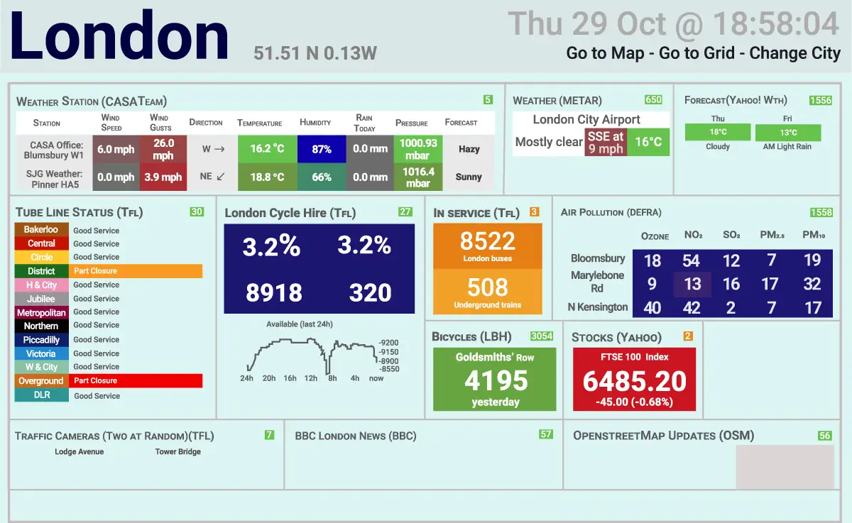
This is a fairy tale of the present. When business analysts swear that “a newly prepared intuitive dashboard will give an instant understanding of the financial health”, the chances to spend an unforgettable night wandering through the jungle of data are high. So, brew strong coffee and take your glasses if you’ve opened the dashboard like this:
But no worries, we’ll do our best to develop this story into a tale with a happy ending. No magic or forbidden tricks — let’s simply expose some common data visualization mistakes made by BI developers and business analysts. This knowledge will arm you to the teeth and you’ll never fall for the bait of meaningless metrics or overloaded tables.
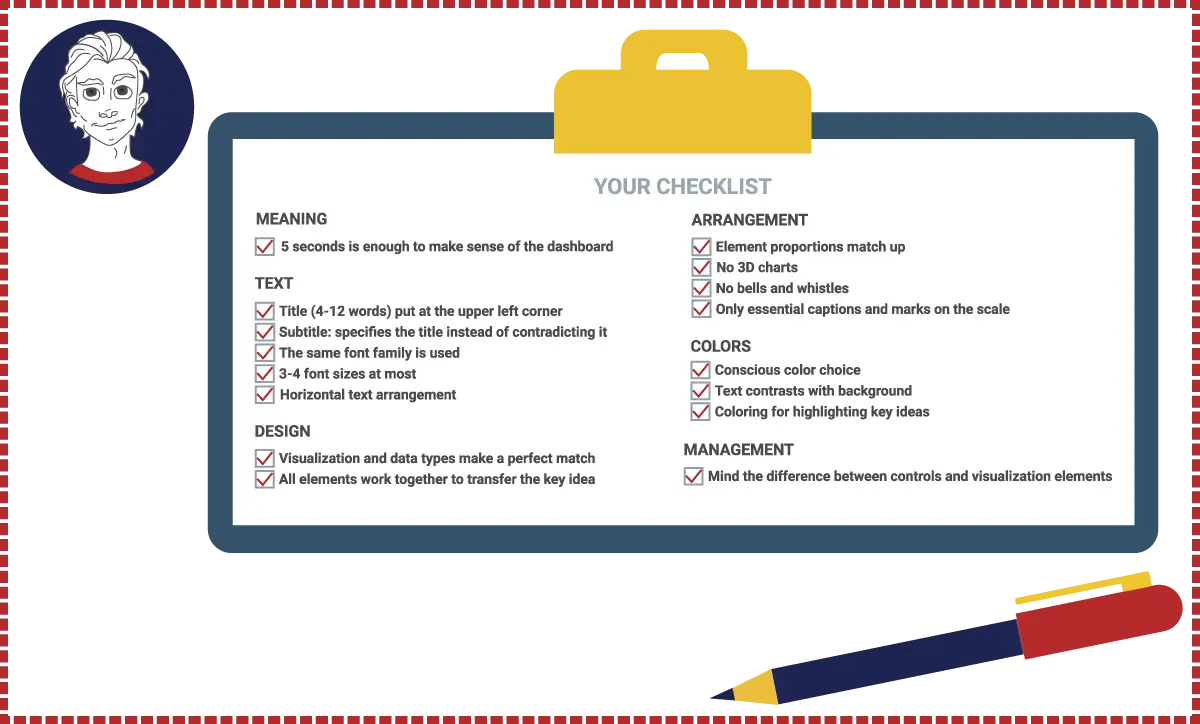
Before we start bringing bad data visualization examples to light, our BI Superhero is riding to the rescue to equip you with a short check list that’ll help to identify easy-to-read dashboard samples at a glance.
What happens if these rules are ignored? Let’s walk through basic functional and perception mistakes that might occur. Ready to disarm each of the far-from-ideal dashboard representatives?
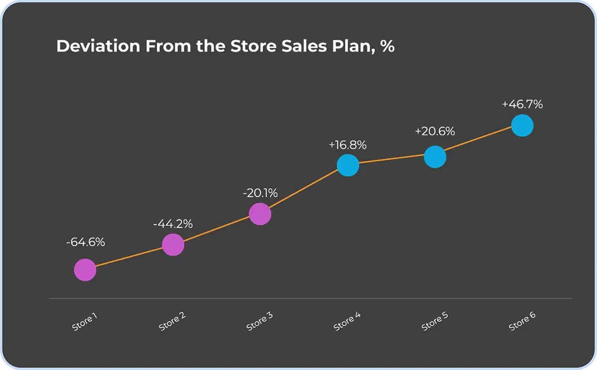
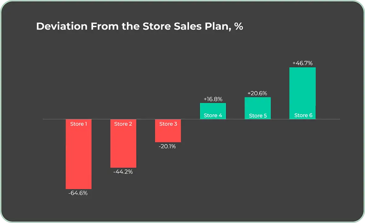
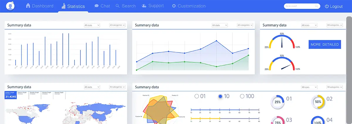
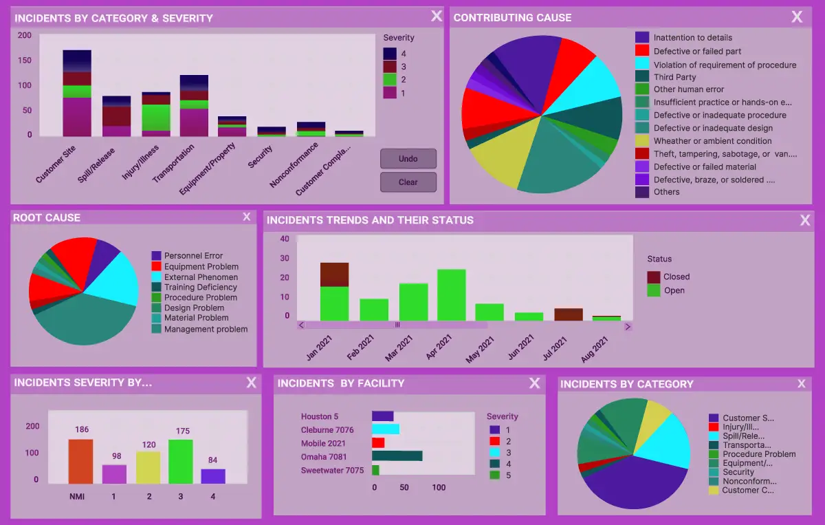
There is a great temptation to exclaim, “Everything!” Where are the axes? How to compare positive and negative values? This is a totally unsuccessful data visualization format that raises endless questions in your head. What about the option below? Looks much more vivid, right?
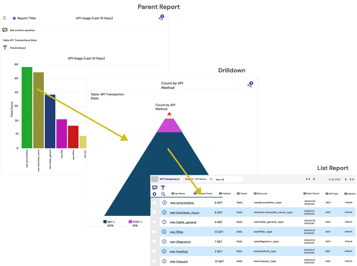
In a perfect world, you’re looking through the dashboard and get all high-level info you need in a split second. Extra details are quickly shown on demand, thanks to the drill-down capacities.
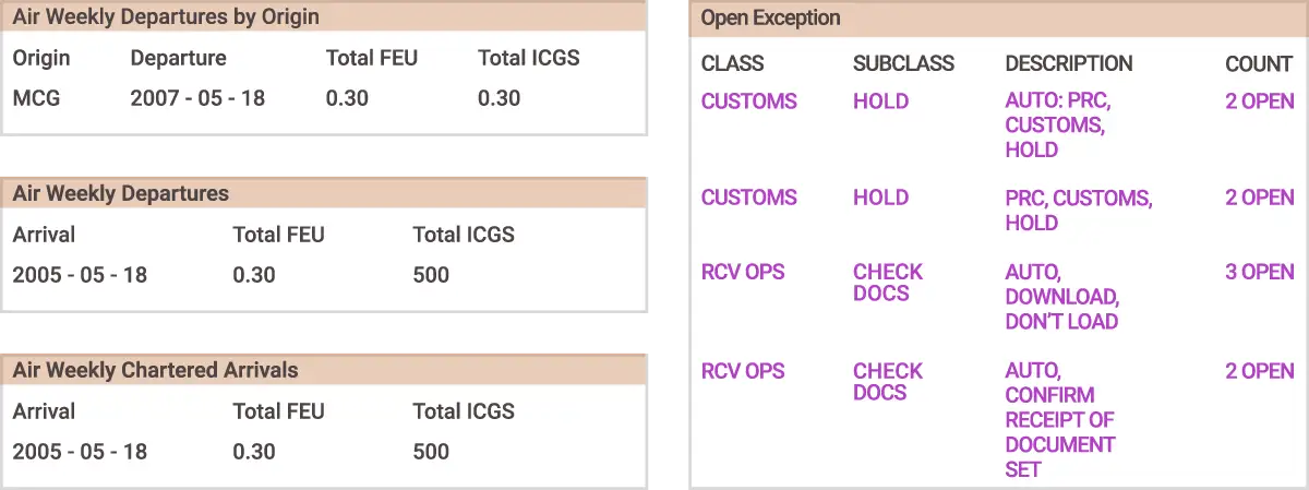
Instead, you’re getting buried by the tons of data and metrics all crowded in one dashboard. Forget about this nightmare and look how to consume massive amounts of data step by step, not fearing to drown in them.
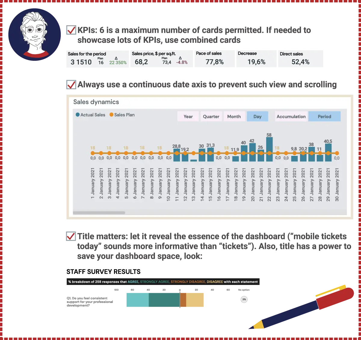
“Less is more” should be a golden rule to recollect and use before duplicating units of measures in each row or adding two decimal places even if they don’t carry a meaning.
Ask yourself a question, “Do these two decimal points make the data more precise?” or “What’s the reason to constantly repeat one and the same word instead of leaving it once in the annotation?”
If this question is rolling off your tongue all the time you’re looking at the dashboard, that’s a bad sign. Dashboard is a dynamic tool that leads to action and data-driven decisions, and it shouldn’t make users confused.
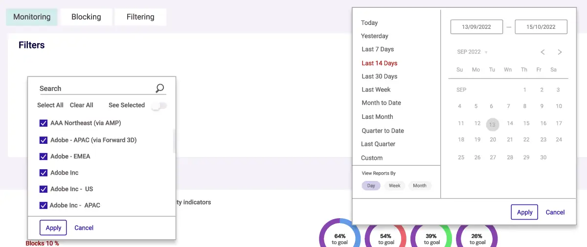
The trickiest reports sometimes try to disguise themselves as dashboards, but it’s easy as ABC to expose them. Interactive elements, like tooltips, filters, drilldowns, and links to detailed reports, mark “live” dashboards from static reporting pictures.
… as they’ll tell you nothing. Or can you come to any business conclusions after getting this? At least, a plan-fact sheet or comparing different time periods, e.g., today vs. yesterday, this week vs. this week a year ago, etc., is required.

Congrats, we’ve dealt with functional mistakes. No time to relax, though — even trickier perception mistakes are coming.

How would you feel if the speed indicators were partially out of your sight? Scrolling an instrument panel hardly seems a user-friendly solution.
Dashboard composition is of no less importance and hugely dependent on the questions it answers. So careful consideration of all elements placement from the very start is much wiser than adding a scrollbar as a “killer feature” that’ll turn out to be a trouble in the end.
Are you staring at a dashboard for a couple of minutes already, failing to get the gist of it? It doesn’t necessarily mean you’re walking in the clouds. The reason is more likely to lie in the lack of focus on essential info, just like in the dashboard below.

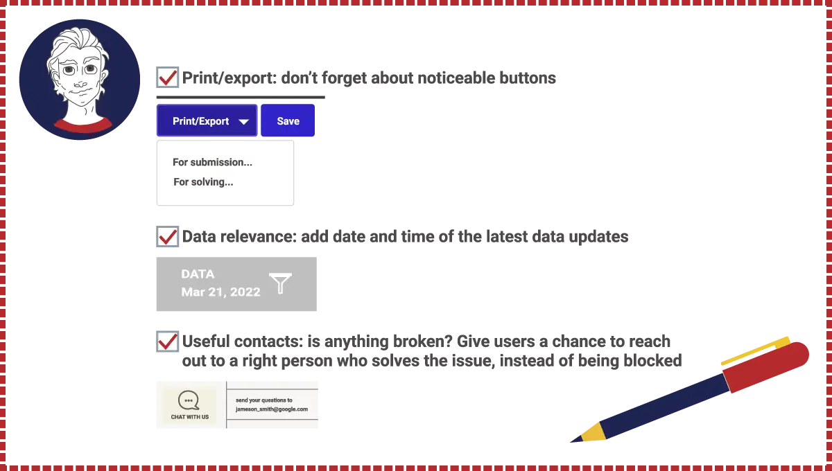
Oxagile is ready to check it out and make your data analytics represented more clearly, if needed.
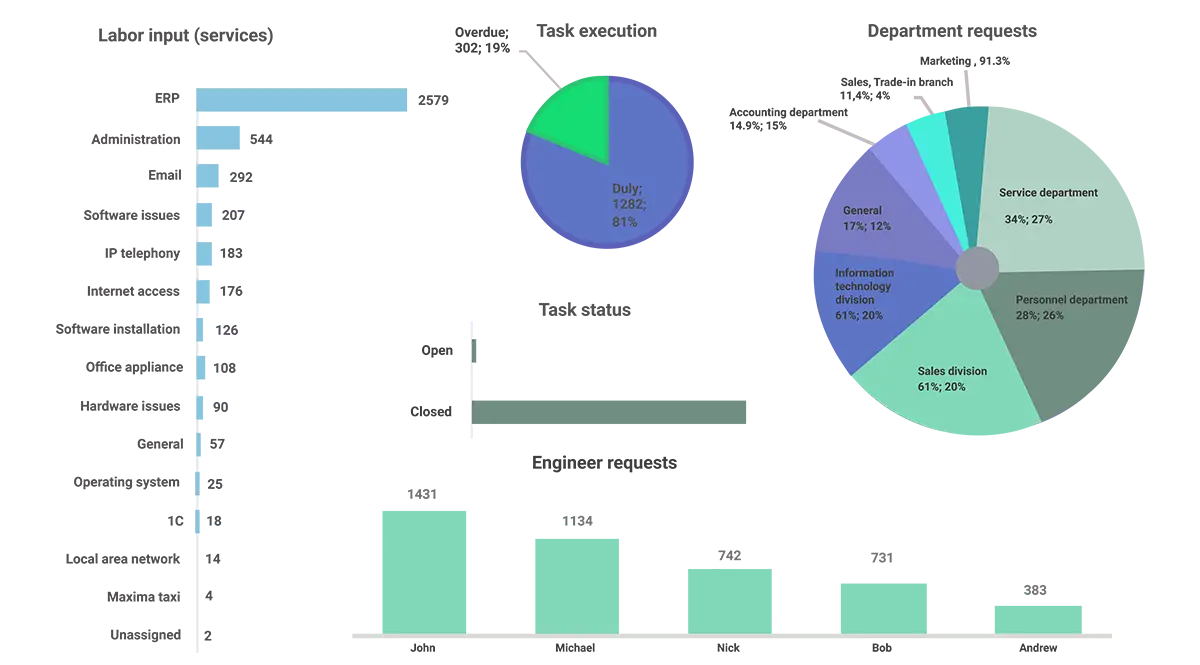
Doesn’t the upgraded dashboard look better?
It seems we’ve already mentioned the “less is more” rule today. The same thought comes into mind when dashboards are dazzling with a variety of colors, elements, captions, and fonts.
Bright and noticeable? Definitely yes.
Easily readable? We doubt that.
How about doing a quick test?
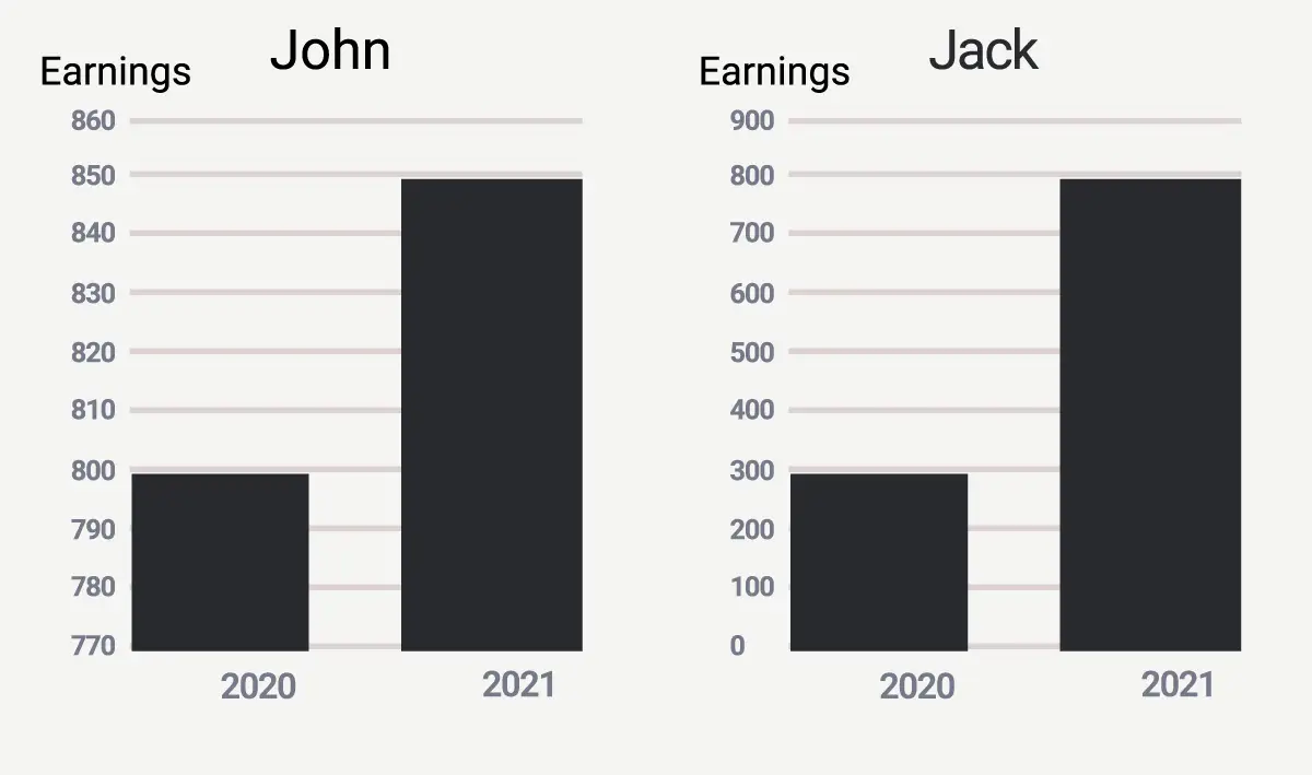
a. Do you feel that John’s earnings were much more significant in 2021 than Jack’s?
b. Is global warming not so terrifying, according to the temperature shifts during the period depicted to the left?

c. Does a 3D chart tell us that vacuum cleaners were the least popular according to the recent sales?
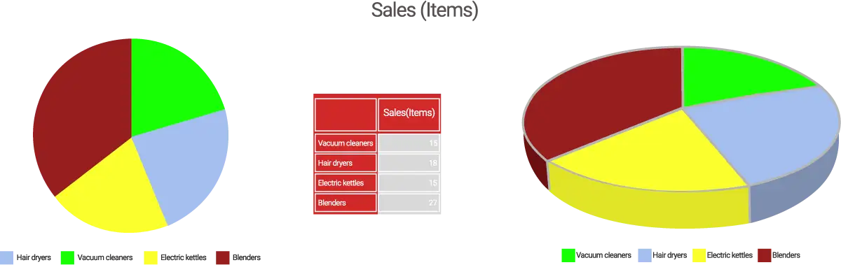
If you answered ‘yes’ each time, you’re likely to become the victim of visual manipulation. Truncating the axis, concealing unwanted data, using 3D distortion effects, and playing other visual tricks don’t make a high-quality dashboard.
What’s more, it’s a question of trust, so faithfulness is the best companion of reliable dashboards.
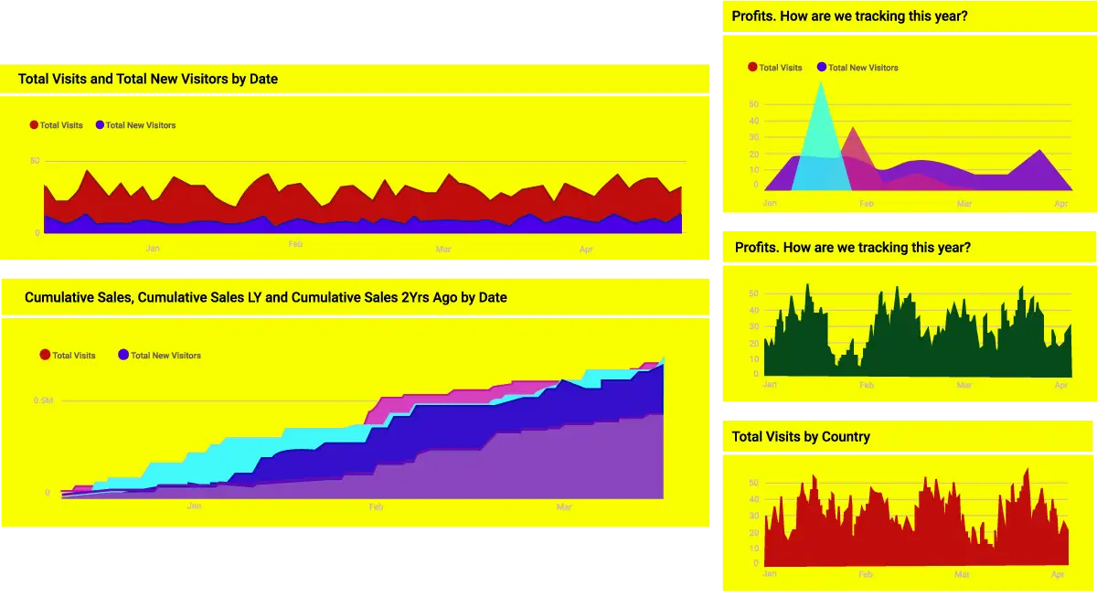
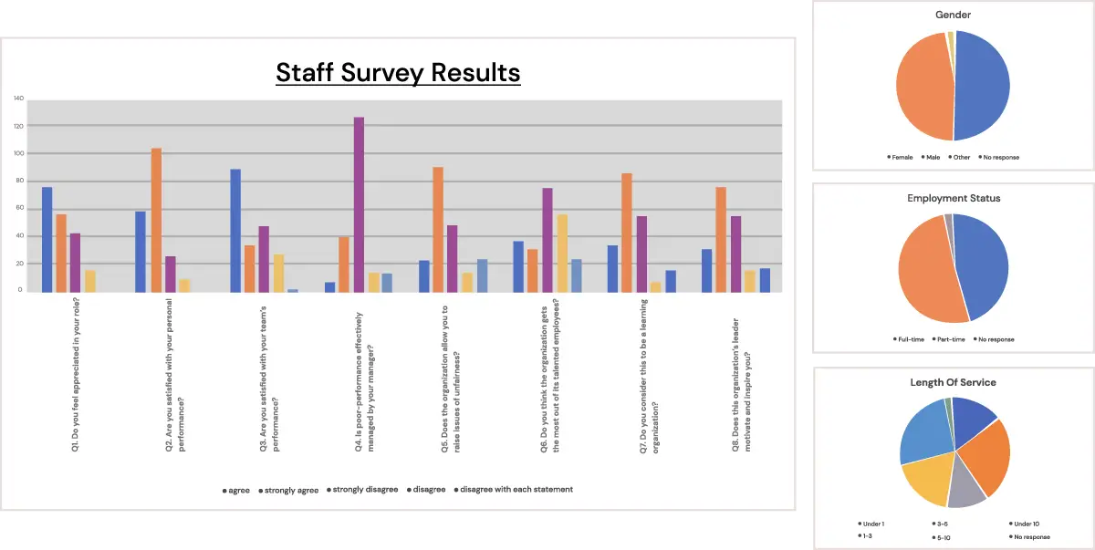
They say one picture is worth a thousand words. But what to do if the pic is so garish that makes eyes bleeding?
No comments, just rules to prevent your dashboards from looking so much queer:
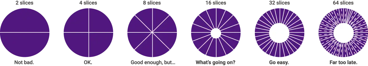
Pie charts are not always a piece of cake, especially when you’re overdoing with its use. If the temptation to decide on a pie chart is too high, at least don’t ignore a couple of basic principles:
A pie chart should add up to 100%, so don’t be lazy to count up every time. Otherwise, a ridiculous situation is unavoidable, like, say:
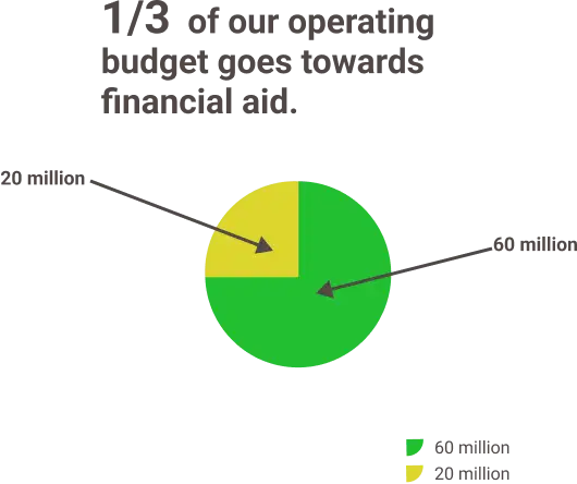
It’s of primary importance to stop in time, and a number of pie chart’s sections is no exception.
Having only one metric to introduce, either as a part of the whole or a KPI level? Just take a look at donuts, as they’re better in it.

Of course, we’re not leaving you without some overall extra tips from our BI Superhero who knows everything about perception specifics.
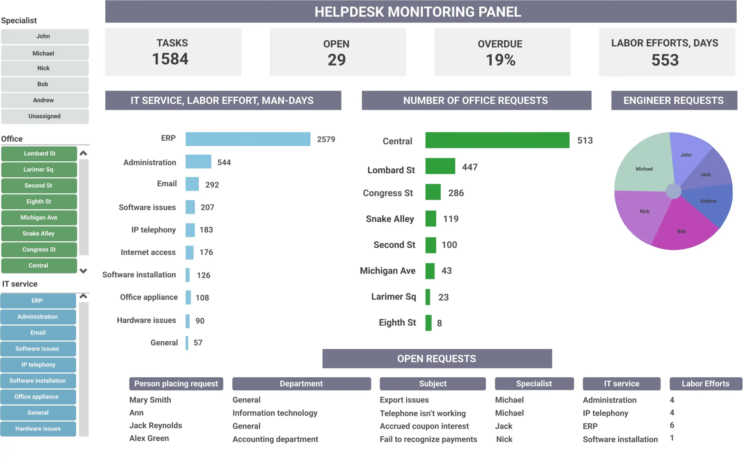
How do all of the rules and tips work in practice when a subpar dashboard is waiting in a queue to be revamped? Feel the difference after taking 5 simple steps.
Step 1. Neutralize the color palette.
Step 2. Capitalize headings and add some context to titles.
Step 3. Skip the color legend, moving color meanings to the title.
Step 4. Change the visualization types: a horizontal bar instead of a pie chart for the right area, a horizontal stack bar chart for the main part.
Step 5. Improve the composition, dividing the dashboard into 2 parts and adding titles for meaningful parts.
Voilà!
Beware that data visualization mistakes have much more side-effects than restless nights and failed attempts to sort the dashboard through. Wrong or postponed decisions are not rare, especially if you’re sick and tired of exploring the dashboard and make yourself a promise to look at it later (read: never).
All those users who have to deal with incorrectly designed dashboards will hardly feel inspired and motivated to introduce data-driven suggestions (especially when this data is hard to perceive).
But we’ve promised you a happy ending, and we keep our word. Although it’s impossible to generate an ideal dashboard in two clicks, experienced business intelligence software development specialists are good at making all preliminary work to reproduce the dashboard able to address a great diversity of business issues.
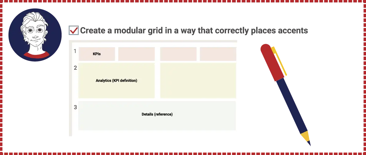
After delving into business objectives, understanding the meaning of data, placing accents correctly, and making the most out of their sense of taste, BI analysts give companies what they need to strengthen their businesses.
And if you feel that it’s time to consult such experts, it would be our pleasure to give you a hand anytime.

